
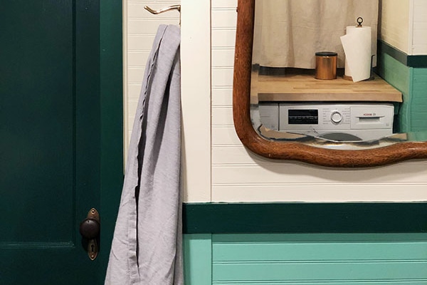
So now that we know how completely awesome Hygge & West’s fabulous new line of removable wallpapers look in my kitchen, you’re probably sitting around thinking to yourself, “self, I wish I could also have some delicious removable wallpaper to light up my walls and life!”
I thought so. I am very perceptive to your innermost wants and desires. I have what they call the gift.*
*of common sense, that is, because who in their right mind would not want to get in on this removable and reusable wallpaper extravaganza!
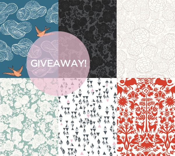
Here’s the deal, folks: the very wonderful wallpaper magicians at Hygge & West are giving away 12——count ’em, twelve!——removable wallpaper panels to one lucky reader!
TO ENTER:
1. Go check out the whole line of Removal Wallpapers over a Hygge & West.
2. Come back here and leave a comment telling me what your favorite pattern is and where/how you would use it! Do you have a wall in your kitchen that could use some fancy pattern love? Maybe you want to cover your refrigerator? Your body? The possibilities are endless!
3. For an extra entry, go follow Hygge & West on Pinterest and pin your favorite pattern! Then just come back here and tell me you did so, so I know to give you an extra entry.
UPDATE: THIS GIVEAWAY IS NOW CLOSED! Congratulations, Jessica!!
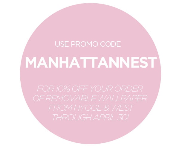
Oh hey, what’s that? A special promo code, just for you? Wallpaper it up, you whacky thing, you!
Good luck, everyone!
International entries to the giveaway are welcome and Hygge & West will pay the shipping. However, the winner may be responsible for international duties & taxes.
This post is in partnership with Hygge & West.


I’d like to win this giveaway for my daughter. She and her soulmate have a very small “starter home” that has a truly awful kitchen. She hates the nasty tile backsplash and I think this product would be fabulous in covering it. They have very little income until they both finish school. I really can’t pick one design, all are wonderful. Love the blog and your creativity!
Otomi Pewter, hands down. There’s one small wall in our dining room that’s just begging for something fancy like this.
Petal pusher in Gray please! I love the idea of the fridge, but my bathroom could use some beautifying – or maybe the back of some bookshelves?
I’m dreaming of that garden noir wallpaper on the wall behind my bed. It’s so dramatic. Love how you used the Hygge & West in your kitchen! So inspired!
Thanks for the chance to win!
I wish very, very muchly that I had the Otomi Cream for the wall next to my daughter’s cot. Then we could play find-the-animal! instead of guess-the-stain! (rental paint, I hate you).
Oh, and I pinned it too.
I would LOVE to put the Otomi tiles in my current guest room, which will someday be a nursery if I get my wish. I think that pattern is perfect for both – something quirky to welcome guests now, some fun woodland friends for a future child. I’d have a hard time picking just one of the pretty colors, though. Probably Pewter? Or maybe a nice pop of color with the turquoise?
Love Hygge & West wallpaper. So happy to hear they are making removable wallpaper.
My favorite is the Oh Joy! Petal Pusher in Gray.
I would totally use this in my foyer. As of right now my foyer is white and need of some TLC. It needs a jolt of life and this wallpaper is just the thing.
Great giveaway!
xo Quinn
Quinn Cooper Style
I love the Triangles (Black) Tiles! The white walls of my rented apartment are bleak and this would spruce up my office space.
I would love the opportunity to use Daydream (Blue) tiles behind my desk area to add some style to my 1970s apartment and break up the drab generic rental paint!
Ooohhhh… Probably Daydream in Sunshine for either my future, as-of-this-Saturday kitchen, or in the nook in the bedroom. Or Petal Pusher. Sort of depends on what I my boyfriend will agree to.
I went and pinned my favorite pattern! :-) Now I get to be sucked in and browse their boards for more time than I have lol.
I love the Daydream Red – the rusty red and butter yellow are perfect for my place. I live in an old clothing factory converted into lofts downtown St. Louis. I have a (like one) small wall – low (only 8 feet) and 2 feet wide – most of the loft has 15 foot walls and is very open – my walls are painted 3 colors: butter yellow, sage green and muted teal – but I have some tomato red accent (along with chocolate brown) and have been thinking about painting that little wall red or, more recently, putting up a pattern…
Just pinned my fave wallpaper and followed Hygge & West on Pinterest!
Quinn Cooper Style
I happily followed some of the Hygge & West boards on Pinterest!!! Pinned some Otomi and the Sparrow patterns…can’t decide which one I like best!
I also pinned Daydream.
My favourite pattern is the Triangles (Gray/Pink) Tile – I’m also a big fan of Lisa Congdon’s work.
I’m currently living in student housing, and while Germans are much less strict about rules and regulations than Americans in this sort of situation wallpapering is still a big no-no. Something like this would be great for hiding that ugly wood-panelled wall that I have, though, or it would also be great for covering the wall that I don’t have any pictures on.
I am absolutely loving the Otomi pewter. I’ll be moving into a new apartment this summer and would love to be able to spruce up the living room. If I can’t have a dog there (boo hoo!), at least I can have cool walls.
I would use Lisa Congdon for Hygge & West’s Triangles (Yellow/Black) Tile on one wall in my bedroom. I’m looking for the perfect dark blue paint and I’m certain they would go well together! I also added it to my patterns board on Pinterest. Thanks Daniel and Hygge & West!
I’m renting and my landlord doesn’t let me paint, so this would be an amazing alternative. I have one inset wall where a double door used to be, I’d love to tile it with Triangles Black. Lisa Congdon is awesome.
I love Lisa Congdon’s Triangles in Black/Grey. I’m moving to my first apartment in September and I would love to use some as an accent wall in the living room, or maybe jazz up the background of some shelves.
I would love to put Daydream in either blue or sunshine all over one of my kitchen walls!!
The Otomi pattern is awesome, it reminds me of finnish folk tales for children. It would look great in my little girls room when we ever find a bigger apartement. But thats a good motivator to start searching :-)
I pinned the wallpaper ceiling, a great idea.
This isn’t lip service, but my fav is black and yellow triangles too! I would use this chance to dress up an accent wall bed my bed. Love this product!
I think my favorite is the Otomi pattern. I’d probably go for the red or turquoise. This would be perfect for the wall behind my bed.
Hi! I’d love the black triangles as a backsplash in my rental kitchen!
Triangles black and yellow,I’d use it in my bathroom.
The daydream sunshine would add a lovely accent to my boring white walls!!
Also, I’ve followed on pinterest, and pinned my fave print!
I followed Hygge & West on Pinterest and pinned those beautiful triangles in your kitchen!
Not to be too big a copycat, but I’d go with the yellow and black triangles. I’d either put it on the wall at the back of my kitchen or on one of the side walls of my living room.
I would love to get the Yellow/Black Triangles for the wall in our laundry nook. We’ve been spending all our free time getting the nursery ready for the baby’s arrival and haven’t touched the little laundry area. This seems like an easy, stylish way to take care of that ugly beige box syndrome it’s got going on right now.
So many choices but I’m leaning towards Petal Pusher in blue. I think that it would look great in our guest room!
Yeah, those yellow/grey/black triangles are clearly the best. I’m moving in with my feller in june, and thinking about ways to transform his apartment into our apartment. The removable wallpaper is totally the right thing!
Drooling over Daydream (Gray) Tile – or as I like to call it Finches-de-verde. I actually want to totally mix it up and use it for a ceiling in my office. What’s that you say? Oh Ya! You guys inspire me to think outside the box. (I also pinned it to my Pintrest account for the extra entry opportunity.)
I LOVE the Triangles (black)! Nothing gets me more excited than a good graphic pattern. I would love to try this as a back splash behind my kitchen sink/stove. My tiny apartment’s “kitchen” is one small strip of white cabinets with a miniature fridge and stove–this wall paper could really help the space feel special–so I can finally stop looking at it with deep hated and loathing.
I’ve had a sample from Hygge & West hanging in my bathroom for about a month now. I would love to have the black and yellow triangles! We’re gutting our bathroom, new tile, wall mount sink, and because it’s so tiny this wallpaper would be the perfect thing to add dimension and interest to the space. It’s a first floor 1/2 bath that is actually visible from the front door (I know weird) so I need to do something bold. We already ripped out the old 70’s sea-blue tile that covered the walls and floor, the seashell shaped sink is also gone. Can you imagine the before and after pictures with the Hygge & West wallpaper and small white hexagon floor tiles? Their gorgeous paper is already pinned on my pinterest board and has been since I moved into this house almost 6 months ago!
Honestly, I can’t go past the Black and Yellow triangles like in your kitchen Daniel. But I’d put them in our bathroom to cover over an unfortunate paint incident that occurred there last year (by which I mean, I tried to paint a wall, did a very bad job and so ran away from it, hoping I could one day cover my mistake up with wallpaper. Hurrah!)
Thanks for the giveaway!
I’m back to say that I’ve pinned my favorite pattern!
A STONE’S THROW AWAY (ALMOST WHITE/GRAY) – On my very long, very soul-less living room wall. I feel the organic nature of the pattern would contrast nicely with the hard lines of the city.
I have been dreaming about the Daydream (Sunshine) wallpaper since the first time I saw it, at least a year or two ago. But now I see the Otomi and my covetous nature is conflicted!
So…one of those. And I would put it in my bedroom where I would see it first thing when I woke up every day!
It’s not fair to make us choose! I could find a place for any of those gorgeous papers. I’ve always been a huge fan if Daydream in grey.
I love Daydream (Gray) Tile and would love to put it in either my powder room or master closet.
I also pinned it to my pinterest! Username alittlelately! Two entries for me!
Just pinned Hygge & West in Pinterest. :)
We just rearranged the tiny extra room in our apartment to be the ‘library’, that Otomi (Turquoise) Tile would look pretty dope in there.
With a baby coming in October I would use the daydream in sunshine tiles to do a feature wall in the nursery. It would look perfect with my old baby quilt which I plan on reusing. It’s also a perfect decor solution as we are long term renters. I’ve already followed Hygge and West and pinned the wall paper to my baby inspiration board!
I would love to have the daydream in lavender in my bedroom!
I love the Otomi pattern- my husband and I love traveling to Mexico, and this pattern would look amazing with some of our beloved treasures we have brought back over the years. I’d love to use it on an accent wall in our new (rental) house in Philly! I’ve also pinned it. Thanks!
I also dropped over to pinterest and pinned/followed.
Great giveaway!
If I win, I would choose the Otomi (Turquoise) tile for my sister’s nursery wall. Her baby is due in a few weeks, and this would really turn a blah wall in their rental house to awesome. Thanks for the chance to win!
As you may or may not know, I currently have nothing to wallpaper as I’m in the process of apartment hunting – but once I find the right apartment that Otomi Wallpaper would find it’s way onto the hallway wall, or perhaps the entryway wall, or perhaps the wall behind the bed…I’ve been in love with the otomi print for a while now so this would just be amazing.
And kudos to you and Hygge & West for opening up the contest to your international readers! It’s such a pet peeve of mine when bloggers don’t consider the readers outside of their country…so “bravo” to you both!
I’ve also followed Hygge & West on pinterest. (I’m @kayinto)
I’ve been eyeing Julia Rothman’s Daydream (blue) wallpaper for my bathroom for four years now–from before I even moved in. But as a renter, actual wallpaper is out of the question. I’d love to use these tiles instead.
I like the Otomi in red. I would look super fab in the boring bathroom of the apartment I moving into soon.
Hi! Yay! My favorite pattern is the Petal Pusher in gray! I want it for the wall at the top of my rebuilt DIYed stairwell and board and battened walls! I was just going to find a super large art piece for that area, but doing the whole wall in a graphic is way more fun! I
pinned it before I knew it was an extra entry; this product is that awesome.
I love your kitchen wall! I can’t decide between the Petal Pusher tiles in pretty much any of the colours or the black Triangle tiles. I would use them for a wall in my bedroom- in the sort of alcovey bits I think. If I had any extra left over I would love to line some drawers with them for a fun surprise every morning when getting dressed :-)
Hard hard hard to choose, but I’ve loved the Daydream wallpaper for ages… the Lavender version would be fantastic in my toddler’s room.
Oh, I can’t decide! The blue Daydream is amazing, but I really like the turquoise Otomi as well – it’s enough pattern to be a statement, especially in that color, but I think on the wall it would recede a bit and not be as bold as it looks at first. I work from home and my standing desk faces the wall, so I’m either staring at a screen or at the wall all day long. I’d love to cover that entire wall with a paper accent like this, so that I’d have something happy to look at!
I pinned the Daydream paper on Pinterest as well :)
I’m torn between the Garden noir or Joy’s (I heart Joy!) Petal Pusher in grey to cover my white laminate desktop!
I love the sparrows and I know they would spruce up our tiny apartment bathroom…and maybe our hallway… and the office :)
After checking pinterest I see that the sparrow wallpaper is called Daydream (Almost White/Green) and I love the images of it used on ceilings.
Also, totally repinned.
The light bird wallpaper that is so pretty an dwould be completely perfect on the wal behind my bed that is still painted woodchip…….
I think I like Petal Pusher the most in grey by Oh Joy! I was initially thinking it’d be a good alternative to a tile backsplash in the kitchen, but seeing everyone’s creative ideas is making me wonder!
The Petal Pusher in gray would look awesome in our bathroom!
I may or may not be obsessed with the Otomi (Turquoise) as it would look AMAZEBALLS in my dining room. Yes, yes it would
Daydream in gray. I already have this wallpaper sample taped to my hallway wall! I am over the moon for it and have been saving my pennies to dress up this space between two bedrooms.
Thanks for the giveaway! I really enjoy the Triangles in Yellow/Black. Hopefully I will be purchasing a home within a few months so the wallpaper would be a nice treat for my boyfriend’s future office.
OMG, I must MUST have removable wallpaper. And, um, I could use it inexpensively. I’m not exactly sure where I’d use it, but I’m moving to Taipei in a couple months and I’m gathering decorating essentials for a rental of god knows what quality. But I think we all know that Petal Pusher (in Taupe/White) will work no matter what. Thanks for the chance! (And, you know, for all the inspiration and stuff)
I just started following Hygge and West! I had already pinned my favorite pattern. ;)
Daniel! I think that daydream I’m grey would be amazing – I have that huge wall in my dining room that is totally blank!
Forgot to mention – pinned it! And followed H & W on Pinterest.
I love petal pusher in grey. It would go really well in my white and grey bathroom.
How does one choose?? I would probably pick Triangles in Gray/Pink for my kids’ room :)
I think my favorite pattern is the Daydream Orange- it would look really lovely in my falling-apart kitchen. My husband and I are renovating an old limestone and the kitchen is still untouched. This would really bring some joy to a really sad little kitchen.
You can see sad kitchen here: http://www.flickr.com/photos/lesterhead/5466893536/in/set-72157624103122697
And I am back to say I’ve followed them and pinned my print- as well as your post from yesterday!
Love the Petal Pusher! I would use it to paper an accent wall in my bedroom. BTW, love how your kitchen wall turned out.
I think I would want Daydream (Sunshine) to do a bathroom a la Emily Henderson: http://pinterest.com/pin/268104984037644754/
or Otomi (Cream) to do behind my sap green velvet upholstered head board. Swoon. Yes I choose this option.
Pinned and followed! (although I didn’t see the Otomi one).
Thanks for the giveaway :)
I am totally in love with Joy Cho’s Petal Pusher in Blue/White. I’m terrible with pattern commitment so I plan to use it on a small wall above the mantle in my bedroom. I’ve already pinned it several times on Pinterest!
Love the Petal Pusher in blue/white for my kitchen!
Definitely the Otomi (Red) Tile. I’ll use it either in my kitchen or my foyer.
Otomi red everywhere! Particularly in our hideously wallpapered hallway! It is gorgeous.
Fingers crossed.
P.S. I followed Hygge & West on Pinterest and pinned my favorite pattern(s)!
Otomi in pewter – there are many possibilities. The fun print would really liven up any room it’s applied to… bathroom, den, kitchen, etc
I love the Otomi pewter and would use it on a wall in my office or the Triangle black in my bathroom. Difficult choice because there are so many I like. Thanks for doing this give-a-way, Daniel.
I’m in love with the Otomi design…I have the perfect living room wall for it. As well as covering the dogs :)
Pinned it too!!
Thanks Daniel!
Petal Pusher in Gray is GORGEOUS!!!!!!!!!!
ARG! Gorgeousness!! Daydream! blue! In my built-ins!!!
My favorite is Daydream (Red) Tile. I would use it on a rather plain bookshelf I have in the kitchen.
I pinned it too!
I just love the Otomi (Taupe) tile, it would totally make my foyer! Have been thinking of wallpapering it from a long time but just didn’t want to make the commitment, but these removable wallpapers are perfect for the job…thanks so much! I am going to pin the pattern on Pinterest now!
Would love love love the Daydream tiles in blue for my son’s room!
Love the colour and the slightly Japan-inspired design.
I love the blue petal pusher. I have a long, very blank wall in my living room. I fail at wall art.
Otomi Otomi Otomi! I think I like the Pewter and Turquoise the best. I just love it. I don’t know where I would put it… maybe all over the house? I’d probably try to control myself and just put it on an accent wall in the bedroom.
Pinned!!!!!!!!
I pinned 2 of my favorite wallpapers too! :)
Thanks! My favorite is Daydream. It would be nice on the wall behind my bed, and I can put off patching the plaster indefinitely.
The daydream in lavender would be perfect for a wall in my guest room!! Thanks!
I pinned the Otomi Turquoise. It’s awesome.
http://pinterest.com/pin/181762534933521827/
Lisa’s yellow/black triangle pattern is without a doubt my favorite. I’d use it in my kitchen to cover up old paneling. I mean, it’s not even real wood. How tragic is that?
The black and white triangles are awesome and I’d use it in my (home) office. Usually I’m not drawn to very feminine home decor, but for some reason I’m crazy in love with the Magenta Garden pattern, which I would probably put in the bathroom. Thanks for the giveaway, and the coupon code! I’ve been trying to find removable wallpaper that I like for a while now, and these are gorgeous!
I followed and pinned the daydream lavendar!
I pinned my favorite pattern
http://pinterest.com/pin/153122456053262749/
Where would I use the black triangle wallpaper? Well, in my classroom to cover the hideous green unused chalkboard that takes up the entire side wall. As a Math teacher I am always looking for cool geometric ‘stuff’ to inspire the kids. My favourite activity in Math class is Art. There’s a quote (which I should rightly name the author) that says something like without math there is no art. This wallpaper would clearly show that to my students!
I’ve been thinking of painting the interior of my two miniscule closets a bright color, but I think wallpapering them would be an even better solution! I think my favorite pattern is the Triangles in Gray/Pink…. although Otomi in Taupe is a very close second!
Petal Pusher Gray! To create a headboard effect in our guest room :)
……and just followed them on Pinterest and pinned my two favorites for an extra entry! Woo, paper!
Pinned my favorite also :)
Otomi in pewter. And I would put it in my entranceway to charm and delight.
The triangles (yellow/black) will liven up my entryway nicely. Gimme.
Is this open for international readers? I would use the triangel grey/pink pattern for some highlights in my old (but new to me) appartment in Dortmund/Germany. I would cover the shabby brown side of the cabinet my refridgerator is built in (and that stands right next to the kitchen door) and maybe make a background for my wardrobe/19th century church pew in the hallway.
OH and I pinned it rotten.
I am in love with the Petal Pusher in blue & white. Why? Because its the most masculine floral wallpaper I come across, it would look incredible in our bathroom which is in dire need of being redecorated. If I was to win, it would give us that push we needed to paint out the room (goodbye brown & taupe boringness) hello butch flowers!
Also, I’ve pinned the Petal Pusher print on Pinterest & followed Hygge & West :)
I would use the petal pusher/black and white to line my pantry.
The daydream orange makes my little heart so happy. On the wall behind my bed, ohhhsoperfect.
I would use the petal pusher/black and white to line my pantry. Also followed them on pinterest and pinned my favorite!
I’m going with my gut on this one. Daydream (Green) is just the punch my bedroom needs. I’m in my first solo apartment and with that comes the luxury of being the boss of my domain/footing the bill of all bossy-like desires. I ain’t complaining just daydreaming that the Daydream (green) removable wallpaper will soon be mine – covering the wall behind my black spindle headboard. Final thoughts…the real boss from Who’s the Boss was Mona.
I would totally go with the black and grey triangle tiles! I would use it for the small wall my desk sits up against in our office. Removable wallpaper= genius!
I love all the Garden Tiles! The cream and mint are so amazing for my new bedroom!( I’m moving to Brooklyn soon! Awesome giveaway!
I am IN LOVE WITH Otomi in Cream. I covered a wall in my kitchen with kraft paper, intending to hand stamp a pattern onto it, but it was so much trouble to put up that I can’t bear the idea of messing it up and having to start over. Removable wallpaper would be a dream!
Just followed them on Pinterest and pinned my favorite wallpaper!
Also pinned my favorite! http://pinterest.com/pin/45176802484641921
Call it inspiration…but I’m seriously loving on the Triangles (Yellow/Black) as well. Would be the greatest next step in giving my cookie-cutter-fixed-up-philly-rowhouse-rental a bit of personality.
LOVE! The Otomi (Turquoise) Tile is my favorite. I’ll be a renter again soon (after living with my parents for awhile), and this will spruce up the new (and painfully white) place quite nicely.
Triangles in black (I pinned the wallpaper twice when it came out). I have this giant wall in my living/dining (open loft space), but the ceiling over the dining space is only 8ft but the living space is almost 20ft. Yes it’s odd. I want to give the wall in the dining space a focus, I want to wall paper a large area of the dining area wall and then frame it. Too weird?
And I am following Hygge and West on pinterest… I did not know it’s prounounced hoo-ga.
I love the turquoise otomi! I have a plan to wallpaper or paint designs in all of the small closets in our house for a bold surprise when someone opens the door! Thanks for the giveaway!
Oh, it’s a touch choice between the Triangles in black or the Garden in noir. I don’t know where I’d put them yet, as we are preparing to move from our current house to somewhere closer for to campus when I start graduate school in June. Probably either in the kitchen or the bedroom. Hmm.
Did some repinning as well!
Having been stalkerishly obsessed with Daydream (Sunshine) Tile pattern for a while, I am willing to fall on my knees and beg for this in order to cover up the beyond hideous blue ‘feature wall’ in the bedroom of my rental.
I’ve also pinned my favourite for an extra go -fingers and toes crossed!
Followed and pinned! http://pinterest.com/pin/193936327676140674/
…and just realized I typed “touch choice” instead of “tough choice” on my first comment.
I love the petal pusher in gray. My rental’s kitchen doesn’t have a backsplash and needless to say, the walls are pretty gross as a result. Would love this to cover them up!
I would love to use the Otomi (red) in all the drawers of my favourite dresser. It’d be the best delight in the early morning.
OOooh. The Petal Pusher (Blue/White) Tile in my bathroom would be gorg.
Oh Daniël, you know us so well!! I looove both the daydream and the triangles. If I would have to choose I’d go for the triangles for my bedroom. To wrap around me instead of a blanket or to put up on the wall. (I have a dark Brown flowered wallpaper on it now, and that was just the wrong choice for me. I regret it big time. Triangles on the bedroomwall would change my perspective on mornings and thus life ;))
Man! I have this little wall in my kitchen I’ve been dying to do something with – and the Otomi pattern would be amazing. I’ll just have to decide between pewter, taupe, and turquoise. Tricky.
and I followed on Pinterest!
I would put the Daydream Blue Tile on our bathroom walls!
HO. LY. CRAP. This stuff is made for me – a person who so desperately wants to be crafty & artsy-fartsy, but just needs someone to design it for her. The Daydream pattern in lavender would be absolutely perfect for my tiny girl’s room; hopefully we’ll be moving soon and I would love to be able to give her a proper nursery!
Yay! I would use either petal pusher in gray or the otomi in pewter! My boyfriend and I are moving in a few months, and I’m so looking forward to changing things up. Maybe an accent wall in the kitchen? Most Montreal kitchens are really small, so maybe it would open up the space like yours :)
Followed on Pinterest!
I love the Otomi pattern in pewter! I would put it in my living room on a long wall to give my all-white rental some texture and color.
I LOVE the black and white triangles. I currently rent an apt and can’t do much to the walls. I’ve already tried using contact paper to create designs but to have a whole wall of wallpaper I can remove would work so well for my current living situation! I would love to use it in my bathroom or kitchen. Both have limited space for much design and an accent wall would really help those rooms out!
I pinned the black and yellow triangles wallpaper from Hygge & West and started following them too!
Love Daydream (Blue) & Otomi. So lovely! Either would make a small bathroom fantastic!
I’d definitely use Triangles in gray/pink in one of my bathrooms. I just bought a house and am in the process of painting all the walls, and wallpaper would be such a nice change!
Otomi red to recover my grandson’s dresser. and possibly the back of his closet shelves. Love your blog!
My favorite is the daydream tile in sunset. I would actually be covering my aunt’s walls – she lives in a house with pine paneling that she’s not allowed to touch, and hates it!
I also followed/repinned on Pinterest!
Oh, and I pinned it too. http://pinterest.com/pin/278167714457086736/
I love petal pusher in taupe/white – it would look lovely in our kitchen or dining nook!
I have to admit I love a lot of the patterns! But my favorite is daydream in blue. It’s time to decorate our bedroom (why does that room always get left for last?) and I think that would be perfect!
I love the Daydream (Blue) and would use it to decorate the wall behind my bed (no headboard)… ahh, those beautiful birds!
My boring bedroom would look a million times better with the blue/white Petal Pusher tiles on one of the walls.
Ooh, Daniel, you have the best giveaways! I just blogged about how we finally found our guest bath sink (in the nick of time…IKEA discontinued it) and the Triangles in black/yellow or Petal Pusher in gray would be perfect for that room. Or maybe in the office…. Thanks for hosting this one! (Could you do the toilet we want for that bathroom or is that too gross ?)
we’re moving in august to a house rental and it is a gorgeous place that’s been sadly mishandled. i’d use the garden mint tile in this hallway/dinning room area or the otmoi cream in the kitchen. so much goodness. also i’m heading over to follow hygge & west on pinterest!
Oh, I want to cover up the weird see-through cabinets in my kitchen so badly. In something bold I think – Daydream in blue or Otomi in red!
I would totally bite your style w/ the yellow and black triangles :) I’d hang it in our hallway, which is in the center of our house. The hallway is the first thing you see when you open our front door — it would be fantastic to fill it w/ Lisa Condon awesomeness!
I just followed them in Pinterest, too. Lots of eye candy there!
pinned/followed on pinterest!
And I repinned Triangles (great that they have your pic up). BRW, I meant, could you do a toilet giveaway, not could you come and install our toilet? Ick…sorry. (Must. Have. Coffee.)
Oh my gosh, I’ve been crushing on the Julia Rothman Daydream papers for YEARS and the Lavender colorway is perfection! I’ve been wanting to put it in my stairwell/foyer forever… le sigh! This would make my damn year!
I pinned this too:
http://m.pinterest.com/pin/197595502373504584/
Followed H&W on Pinterest too!
Hi!
I found your blog via another shelter blog – can’t remember which one – and read the whole thing. I’m amazed at what you’ve done with your place. The kitchen… oh my!
Hands down the Otomi in red. It would fit in perfectly with the rest of the apartment – a combination of our various home countries resulting in dutch wax curtains, Moroccan furniture, kilims and such. I have a very sad kitchen that is just waiting for some brightening up!
I’ve wanted Lisa Congdon’s black/gold triangle pattern since the day it came out. I’m planning a built-in breakfast nook in my kitchen and think that pattern would be perfect above it.
Also, I’ve pinned the wallpaper at least twice now!
Huge fan of your blog and a regular reader — you always make me laugh. My mom and I want to cover the ceiling of her office in Daydream (Sunshine colorway)… Maybe even a faux coffer/beam situation with the tiles filling the negative space if we’re feeling particularly fancy.
Daydream (Gray) Tile is my favorite. I’d use it for 2 accent walls in my galley kitchen.
I’ve also pinned it on Pinterest.
My favorite pattern and has been for some time, is Julia Rothmans Daydream! I would use it in my studio:)
Also following on Pinterest!
Petal pusher in gray, for my bedroom. Although the triangles look so sweet in your kitchen, I could probably but those to use somewhere as well.
Great giveaway – and your little dining area in kitchen is perfection.
I am dreaming of my hallway filled with petal pusher in blue. As it currently stands we pass through a dim 3×6 area with 4 doors and even more shadows. As the place where all rooms meet you would think a bit of Pow! Is in order.
I also pinned Garden Noir (for my other much more dramatic and nonexistent) home.
Love the kitchen by the way. Marvelous much.
I want to wallpaper my tiny kitchen with Triangle (yellow). I’ve also repinned this. Thank you for the great giveaway!
This is amazeballs!
I would love the Otomi Red Tile! Thanks for the giveaway!
Otomi (Taupe) Tile! I want to put this on my bookshelf.
ANND I pinned it!
Thanks again!
http://pinterest.com/pin/40884309089681415/
I love the Magenta Garden Tile!! It would look so swell on my accent wall in the dining room!
Also repinned just now. So many great ideas.
I love the Daydream (Orange) Tile. I’d use it in our yet-to-be built nursery after our upcoming move. This is a perfect way to inject some personality into a boring rental space!
I also pinned my favorite design! http://pinterest.com/srp66/decor/
I can’t believe it! I just pinned Petal Pusher in Gray to one of my Pinterest boards couple weeks ago! Would love to take down the dingy, peeling wallpaper in my dining room & make it look like something special for once. Fingers crossed!
Geez it’s hard to choose, but I’d probably go with Daydream in lavender for an accent wall in my boring apartment bedroom.
Even though I’m immediately drawn to the magenta Garden paper, I think I’d have to go for the Petal Pusher. All the colors were beautiful, but the gray or black/white would work best in my little rental.
Pinned Petal Pusher too :)
The Otomi Red tile is my (cat’s) favorite. I’d use some of it to redecorate the outside of her cat house as it’s currently just a snooze-fest of grey. Plus my cat loves the natural imagery in the pattern (she told me so). The rest of the panels will be used to jazzy up my tiny bathroom in my apartment and really make it pop!
Also, I’ve pinned it!
I LOVE the Otomi in Red! I have this weird angled wall in my apartment and I think wallpaper would be perfect to make it un-weird!
It’s really hard to choose but I think I’d go with Otomi (Pewter) Tile. I am moving this weekend into a cool, modern townhouse. We will have an open floor plan with the kitchen, office, and living room area all being downstairs. I think this wallpaper would be perfect to separate the living space from the office from the kitchen.
Triangles yellow and black tile. I would do a wall in my dining room.
I would love to beautify my small rental kitchen with the Otomi (taupe). It has no backsplash — not even any tiles — so putting up some pretty (removable) wallpaper would be the ideal solution to brighten up my culinary experiences! Thanks so much Daniel for this giveaway, whomever is lucky enough to get this one will be ECSTATIC!
I have also pinned the Otomi pattern on Pinterest.
I love the triangles black! It would be perfect to finish of my kitchen reno!
Also I added them on Pinterest and pinned it UP!
I’ve had the yellow Daydream pinned for quite a while (and I’m following Hygge & West on Pinterest!). My sister and I were super excited to see the removable tiles become available. Now I’m pining for the Blue Daydream tiles to paper a wall in the nursery for my first baby on the way. (And if there were any left over I’d put some on the ceiling in the tiny tiny foyer of my rowhouse.)
Also, I started following Hygge & West on Pinterest. Forgot to add that to my comment.
Followed and pinned! http://pinterest.com/pin/158963061819988574/
I would have to say it’s a tie between Petal Pusher in gray (or cream) and Daydream in Sunshine! I LOVE IT ALL. I think I would either use it as backsplash in my kitchen (since I have nothing but bare wall, ugh) or on the opposite wall across from the cabinets. Can you tell I’m a little bit indecisive? BUT I would still love it all! Hooray for temporary wallpaper!!!!
I love Hygge & West’s wallpaper! I’ve been coveting the Daydream (Blue) print for my entry way! What an amazing giveaway!
I need these tiles! I would put the Petal Pusher (Blue/white) all over one wall in my bedroom. Here’s why:
When I moved into my current apartment last summer, my landlord didn’t paint the walls in between the former tenant and myself. The girl before me had wooden motivational phrases nailed into the wall all over the apartment, but mostly in the bedroom. Each letter had 4-8 nail holes. So…one wall in my bedroom has about 200 nail holes, and it’s the wall my bed faces. To make matters worse, I’m not allowed to paint the apartment, but my landlord decided to be nice and paint that wall. He painted it a green-tan color. It looks like vomit. And he didn’t spackle beforehand, so the wall is now ugly, AND still full of holes. I fall asleep looking at this thing. It’s hideous. It needs to be pretty. It’s crying out to be pretty. And my brain needs to look at something pretty before going to sleep, instead of pock-marked puke.
(I totally did the Pinterest thing, too. I need all the entries I can get.)
Daydream in blue would look fantastic in my half bathroom. I also love Otomi in red, though I’m not sure where I would put it.
Also, followed them on Pinterest.
The black and yellow triangles take the cake. We have a nook in our hallway that is always feels a bit bland and disjointed. This stellar pattern would make the short bookcase pop and help it become a cohesive space.
I’ve pinned the yellow triangles pattern as well!
I love the taupe/white petal pusher! Not sure yet where it would go, but we have a whole bunch of blank walls in our rental that need some love!
Otomi (Pewter) for me! I’m about to move to a new apartment with a small bedroom, and I think using Hygge & West wallpaper on one wall would be the perfect thing to open up the space.
And I pinned it as well :)
And pinned. :o)
Otomi in taupe would cover up the hideous fake wood paneled wall in the dinning room of my apartment quite nicely. I also followed and pinned. Thanks!
The garden tile in mint would look delightful in my entryway. I’d love a huge splash of color!
Ok, amazing giveaway! I’m already planning to wallpaper our small vestibule in the dark graphite petal pusher design. But now I really want to use removable tile paper on our guest room ceiling… maybe in the Otomi pattern! How fun!
I’m totally in crazy stalker love with that Otomi pattern (maybe gray? red if I feel sassy?) I have a curved accent wall on my staircase with a huge stained glass window and a little built-in bench (things were so cute back in the 1880s.) This paper would look perfect there and also cover up the janky plaster better than paint!
I have also pinned some Otomi over on pinterest (I’m caitkitt). Entries x2 FTW!
Otomi Taupe Tile for our bedroom! Maybe only one or 2 walls with a contrasting color. I also pinned one of my favorite designs on Pinterest!
Ah Daydream, how I heart you. I would wallpaper our teensie, tiny powder room. I’m thinking this wallpaper would make me feel like I was in the great wide outdoors even though it’s such a small room. Fingers crossed!
Two weeks before giving birth to our 2nd baby we’re moving into a brand-new-no-character-or-soul condo (fingers and toes crossed I don’t go into labour the day of the move!). Kids will be sharing a room and I would LOVe to put Daydream (Sunshine) tile on one of their walls. Since your last post I’ve even calculated that we will need around 16 tiles total to make this happen. The whimsical (and not too kiddy) design would be perfect for a shared kid’s room.
That’s a lot of unplanned cash for a family with a newborn, BUT winning 12 tiles would absolutely make this dream project a reality for my babies (I mean, for me! :).
pick us pick us. I’ll post cute baby pictures once the wallpaper is up! ha ha.
It’s so hard to decide between the amazing patterns but I love the black triangles (followed and pinned here: http://pinterest.com/pin/184788390933187823/). I would probably use it in my tiny rental kitchen to liven things up and wrap it over into the dining room as an accent wall. Though also tempted to put it on the wall behind the bed…and maybe in the office…
Thanks Daniel for inspring renters everywhere, and to Hygge & West!
Pinned the Daydream pattern too: http://pinterest.com/pin/199847302187302627/
Because I have, ahem, awesome taste, I would choose the same wallpaper black and yellow triangles print as you did. It would be a perfect solution for the uneven wall behind my bed, which has been impossible to put any art up on. I’ve pinned it too!
I had such a hard time deciding! I am moving into an adorable new apartment in Astoria next weekend, so this would SO help with the lovely new “what colors do I paint everything?” debacle.
I think I like the Petal Pusher in Taupe the best… of course I’ll probably change my mind 10 more times, so I’d better just submit the comment now!
I love the TRIANGLES (BLACK) TILE. Would go great in my black and white bathroom
Oh, and I pinned the Otami pattern in Turquoise! It was nice to see it on a whole wall.
I would use Garden Noir to bring some drama to my kitchen.
daydream sunshine is so cozy looking! would use it in the kitchen or bathroom
not to be a copycat or anything, but I also have a weak spot for the Triangles paper although the Garden noir is a close second. Totally repinned your kitchen photo to my inspiration board for house projects.
Pinned my favorite: http://pinterest.com/pin/74239093830096794/
Ah! I either want the Lisa Congdon triangles or the petal pusher in gray! Love them! Thanks for hosting this giveaway!
i would love to use the Triangles (Yellow/Black) in the spare room off our living room. my husband & i built a wall bed last year for guests and i think it could use some wallpaper on the face since its folded up most of the time. thanks, daniel!
I love them all(!), particularly the Daydream in blue and the Ottomi in red. If I hadn’t read your post, it would never have occurred to me to cover our crappy, stained, and ugly apartment refrigerator in removable wallpaper…but that’s exactly what I am going to do! Assuming I win of course :) The fridge has depressed me since the day we moved in, but this could be just the ticket to lifting my spirits. Pinned on Pintrest.
i love love love daydream in grey or blue! which is great because those are probably the only ones my fiance would let me get away with. i would put them in the entryway of the house we are moving into together.
if it was solely up to me, i’d be all over the yellow triangles SO FAST (i love yellow!) but it’s also the one color that is on the list of “not allowed to use” :(
also– followed on pinterest and pinned the daydream grey room!
love the idea of removable wallpaper, I tried putting regular wallpaper up in my rental with double stick tape on a grid of painters tape and it worked ok…for a few months…this would look much better! I love the lisa congdon in black and white, though the petal pusher in taupe/white is also great!
i looked at all of them and tried to picture them in my kitchen (i have a desperate need to cover a backsplash-area-that-doesn’t-really-function-as-a-backsplash) and it turned out i liked the triangles best!! now just have to decide between your yellow and the one that’s all black….
also, just pinned your kitchen- it looks great!
pinned it too!
I pinned Petal Pusher in gold from Hygge & West’s page!
I LOVE the Garden (Mint) Tiles – it would look lovely in my bedroom. I’m trying to go the chinoiserie/japonisme route and I think this will do nicely in the bay window/alcove area. Not allowed to paint at all in my rental apartment so this is the best solution I’ve found! And once I move, I can take it with me!
pinned/followed here: http://pinterest.com/pin/120823202475840858/
I’d have to go for the Daydream (which I’ve lusted after for years), probably in blue. It would be for our guest bedroom, which already has an accent wall but it is a horrible dark red. My plan for it is to have a blue-black-white colour scheme with yellow accents.
Pinned it, too.
I love the Triangle Tile in all black! We’re moving in a month, so it would go up in our new rental! Thanks for the opportunity to win!
The Daydream (Orange) tile would fix up my home office. The walls (color inherited from previous occupant) are green green GREEN, and I’ve got a wall that desperately needs some white on it, and the orange birds would accent it perfectly.
I’m in love with the Otomi red, it’s amazing! I would use it either on a wall in my kitchen or the backs of my open kitchen cabinets. (And yes, I pinned it too!)
I’m torn between the modern, geometric Triangles (yellow/black) and the moody, whimsical Daydream (gray or lavender). We are renting a very old home. The kitchen is so dated and could really use something like this to make it feel more “us”.
I really love the Otomi in red and the white underwater one. I think I’d put it on a feature wall for my office!
Following hygge & west on pinterest, and pinned! http://pinterest.com/pin/245798092135194563/
I love the daydream in blue! We are in the process of tearing down drywall in our guest bathroom right now and when new stuff goes back up, I would love to cover it with this! We plan to move in a few years so removable wallpaper would be fantastic!
I’m following them on pinterest!
I love the Otomi pattern in turquoise. It was a tough decision between that and the triangles, but I’d like to add something vibrant to our bedroom, and the woodland motif is beautiful. Our bedroom has a sloping ceiling that ends in a wall 4 ft high, next to which we’ve placed our bed. I’d like to cover the wall next to the bed, and I think the turquoise would look great with our eggplant and grey bedding, and next to our grey and pink curtains.
I’ve also pinned the Otomi pattern to my Ambiance board on Pinterest.
I pinned “Daydream” because I need a little of that in my office to help me finish setting up my new wordpress blog site. This old gal is such a newbie! Cheers, Yvonne :)
Due to an accident with some red wine and horrible rental (ie, cheaply) painted walls, we have streaky stains we cant erase! The Otomi Pewter or Petal Pusher in Grey would certainly keep the landlord”¦ er happy!
I think it would be cool to do the inside of a closet with this! Thank you!
Daydream in sunshine! Do you know how much I love birds?! This would be perfect for my bedroom. My room is about two times wider than it is long and having this on the wall of my little desk nook created by my built-in pop-out closet and the steps leading to my doorway would really define that area. I would be so happy staring at those birdies during eye-rest breaks.
This is so awesome! I would spruce up my guest room (aka junk room with a bed in it) with either the Otomi in turquoise or Daydream in orange.
I pinned the daydream in sunshine on my pintrest. Keep blogging, I check your site regularly and really enjoy your writing!
I followed and pinned my favorite :)
The TRIANGLES (BLACK) TILE would look amazing in my office.
Lisa Congdon’s triangles (black) please! I adore how the triangles look in your kitchen and would love to recreate that look in my hallway with a black, white, and red color scheme.
ooh, I actually want to use the gray and pink triangles in the bedroom as an accent wall. love!
annnnd I pinned my favorite to my homegoods board: http://pinterest.com/morirdepena/homegoods/ and am following Hygge & West! Thanks for doing this Daniel!
i also just pinned another favorite on pinterest —carved ogee— would look great in entry way of apt.
I love the triangle tile pattern you chose. I think I’d go with just black, though!
My parnter’s job and mine keep us moving (and therefore renting) new places every 2 years or so. I’ve always been a crazy big fan of prints and was jealous when wallpaper started having its most recent ‘moment.’ I would die for the Otomi in Pewter behind our bed. And I respectfully request double bonus points for pinning this yesterday before you even asked. ;)
Petal Pusher in gray, for the wall in the bedroom with the closet door and the bedroom door. and one sad mirror that is not quite in the middle of the wall.
and also pinned. :)
I also pinned the shot of your apartment from the Hygge and West pinterest: http://pinterest.com/pin/195625177536507247/
I love the grey/pink triangles! I just moved to a new home and in the midst of living out of boxes am in full on decorating mode. Maybe I would put this in the bathroom!
I’d like to win to make some amazballz decor for my big sister’s wedding. The venue has some questionable walls and mounting these on some foamcore would be a perfect photobooth backdrop. I’d definitely go with the black and grey triangles. And THEN I’d totally steal them and use them in my kitchen.
Plus, I already pinned it here after your post yesterday!
http://pinterest.com/pin/160581542936059738/
My favorite pattern is Otomi in white/turquoise– I’d love to use it on an accent wall in my bedroom!
It is so hard to pick a favorite! But I think the daydream in grey is my fav. It would totally make my kitchen look a bit more “done”. I keep struggling with getting my rooms to look finished and done. I usually end up somewhere “college dorm done badly” and “almost there”.
I followed Hygge & West and repinned one of my favorites
I love the Daydream in the Sunshine color. I would love to put it in my mud/laundry room with the light blue and white checkerboard linoleum tiles.
I love their wallpaper and I agree, as a renter this is awesome! I’m infatuated with the Otomi in red. We live in a Minneapolis (right in Hygge & West backyard!) bungalow which needs some separation between our living and dining area and having this on an accent wall would be awesome facing our wood built-in buffet.
And I pinned it too! http://pinterest.com/pin/89509111316825516/
Otomi in turquoise, fo sho. I’d put it up behind my coat hooks in the entryway so when people walk in they’d get a glimpse of something pretty right off the bat. (Your yellow + black triangles is a closeclose second, though! Love that so much. But who wants to be a copyer?)
Daydream (Sunshine) is gorgeous and I would LOVE to use it for one wall of my kitchen. It’s a wall that picks up light from a skylight in the morning and that pattern would be the most gorgeous lift for that room. It makes me happy just thinking about it!
I pinned the gold petal pusher on Pinterest! http://pinterest.com/pin/132715520241480225/
First of all, your kitchen is amazing. I can’t believe how much you’ve transformed a rental space. The new wallpaper is the perfect addition.
Yes, I love all this wallpaper too!! I would totally get the black colorway of the “Triangles” pattern and hang it in my bedroom. I re-pinned it too :)
My favorite pattern is the Petal Pusher by Joy Cho. I think I’d cover a wall in my bedroom with it, or my studio, or a really sad coat closet that needs some cheering up. I pinned it too. http://pinterest.com/pin/141722719496455493/
Garden (Noir)! Because if it is black I need it in my life. And I totally want it for a feature wall in the living room. We are thinking of doing a bamboo wall in there but I think I could talk everyone into loving this instead! Also totally pinned it!
Oh yes! I do want! I’d love to put the Daydream in Blue in my front entry way.
Oh my goodness – these are beautiful and I love that they are so easy to use! I have a boring wall in my living room that I can’t figure out what to do with and some gorgeous wallpaper would make a huge difference! Daydream Tile in Orange is the bees knees!
I followed them and I pinned this:
http://pinterest.com/pin/152700243587991395/
Thanks!
I followed Hygge & West on Pinterest and pinned my favorite: http://pinterest.com/pin/93309023502471483/
Otomi in Turquoise is gorgeous! I’m almost afraid that my kitchen will explode from the excitement but it’s worth the risk. I pinned hygge and West as well and find myself asking why the HECK I hadn’t alreay pinned it.
I would love to win the Daydream (Orange) tiles for my kitchen. We rent, and haven’t gotten around to painting it a normal, non-depressing color (it’s currently a terrible shade of cream/yellow that looks like it was slapped on by a toddler). I would put it on the far wall next to the fridge – then you could see it through our little window to the living room, which has 1 burnt-orangeish accent wall (I love accent walls!!) Sounds kind of weird, but I promise it would be perfection. Thanks for having this giveaway!!
I have a little nook in my living room that houses my desk. The otomi blue wallpaper would be the perfect addition to make the nook stand out in my rented apartment!
My favorite pattern by FAR is Lisa Congdon’s triangles. I was so excited to see it up and on your blog yesterday. I’d like to cover our closet doors with it. These doors are super hideous and need a facelift!
Also, I follow Hygge&West on Pinterest and also pinned one of my favorite uses. Cheers!
Love them all, but my favourite is Petal Pusher in black and white. Our kitchen needs serious help and this could be just the thing. Thanks very much Hygge & West for the giveaway!
Daydream in orange for the wall behind my bed in my lackluster rental bedroom!
Hi, I’d love Petal Pusher in taupe/white for my bedroom wall. The pattern in lovely and with the neutral colorway, it’ll work great with all colors/patterns.
Daydream in cream to create a headboard for my bed!
Also, I just pinned some of my favorites. They have so many awesome patterns.
I’ve been CRAVING the Daydream in Gray for a small nook in our bedroom. It would look stellar paired with a white dresser I’m working on.
I love the Triangles (Yellow/Black) Tile wallpaper!! I’d make an accent wall in out guest bathroom!
And I pinned it! http://pinterest.com/pin/263179171947049818/
I am dying over the Petal Pusher in taupe/white to use on one of my bedroom walls!
The Otomi pattern in pewter would be perfect for our foyer.
After your first post about the removeable wall paper I had already gone to their website and perused! I would love Daydream (colorway Sunshine)…in my washroom, I LOVE it!!!
I would love the daydream blue tiles! This stuff looks AMAZING!
And I’m following their pinboards!
I love Daydream in gray. I would use it below our stairway (an accent wall) or behind a desk in our art room. Pinned it too! http://pinterest.com/pin/175077504236605883/
I’m following on pinterest and just pinned this pin:
http://pinterest.com/pin/249386898088304414/
Pinned it too! http://pinterest.com/pin/85216617921848664/
I like petal pusher in Grey the best. Honestly, I’d love to do my ceiling. Yes, ceiling. I have a terrible drop ceiling and I can’t exactly paint it. I have no idea if it would work to cover it with this and it might be way overwhelming but I’d LOVE to try something.
Ermergerd these are so snazzy. I’m in love with the Daydream (Blue) to amazeballs up that awkward/weird wall in my bathroom from sad to happy. I also have a little Arwel Jones-ing for Garden (Noir) as backdrops to my cheapo bookshelves. It reminds me vaguely of Sherlock.
And I pinned it! <3
http://pinterest.com/pin/141230138287096240/
Daydream (Blue) Tile for the nook at the cottage.
I’ve been in love with the Daydream wallpaper for THE LONGEST TIME. I’m convinced the red colorway would make my kitchen come to life! I’m thinking an accent wall, like what you did in your kitchen, but 12 rolls? Maybe a bigger wall!
Also, I pinned it, too. http://pinterest.com/pin/76561262387952697/
I quickly chose the Triangles (Black) as my favorite removable wallpaper. But then when I went over to pinterest to see the wallpaper in action, I pinned the petal pusher (in gold which i don’t think is one of the removable ones). It’s a toss up! We are in the process of moving to Seattle so I cannot say where I would put this lovely wallpaper, only that it would certainly be amazing in our new apartment.
Lovelovelove also NEED! Is it super bad if I copy you? Triangles black and yellow
Is the prettiest, but also love,the black grey, triangles. ðŸ‘
Also pinned my fave
i luurvee the Otomi and Garden tiles! i would probably put it on the wall behind my bed to be safe, but if i was daring i would put them up in the hallway of my aptarment so much pattern! :)
Otomi Taupe for me! I’d love it on my office wall – something pretty to look at for inspiration : )
Well, I really like the daydream (sunshine) but if I bring one more bird-related thing into this house my husband’s head will explode. That’ll make a real mess, so I pick petal pusher (blue/white). I’d use it in a window-less powder room which can use some bright and happy.
The Otomi in Pewter please. I think it would look fantastic in my bedroom for which I am currently looking for a sweet 6-9 drawer low walnut dresser. Mm mid century modern with fancy wallpaper.
And I just wanted to say thanks for writing this blog. It’s always so inspiring and entertaining. Best part of my week when you post something new.
Oh my Daydream (Orange) Tile. This would make my windowless, barren, dark, dreary kitchen siiiiing! I’d love to put these puppies up on one wall to pop some color and life into the otherwise sad and uninspired space. Being that we also live in a rental, I’d love the option to dress it up without the landlord hunting us down for making it too cool for him to handle.
Pinned and pinned again.
I am crushing on the Otami in Pewter. This would look great on my closet doors! Thanks for the great giveaway!
I love love love the Petal Pusher pattern in Grey, though I really wish they had a removable tiles in gold. So blingy.
I would use it in my bedroom for an accent wall.
I’d chosoe the “DAYDREAM (ORANGE) TILE” for my, strangely shaped little entrance hall. I’ve left it the too dark muddy green my landlord painted it until I could think of what to do, and the light pattern would be just the thing to lighten up the space!
Oh! I just pinned my favorite pattern too!
I absolutely LOVE the black and yellow Triangles tile. It would look fabulous on the back of my kitchen island that is facing the living room. Since it is an open space, it will help create more distinction between the two rooms. Also, the back of the island is unfinished, and the landlord will not let me paint it. The removable tiles would be perfect as they are non-destructive and I’ll be able to remove them whenever I move out (which might be a long time if I’m able to make the space nicely designed!)
I’ve pinned it too!
http://pinterest.com/pin/110197522104843619/
Pinned it too! http://pinterest.com/pin/50665564530473638/
I have been eyeballing Daydream in orange for my entryway FOREVER!! It gets no natural light and is a little depressing. I live in a rental though, and I’ve been hesitant to pull the trigger because $$$ and I couldn’t exactly take it with me when I move. BUT if it were REMOVABLE! I would be able to take it! So it would basically be an ideal situation.
I would have to choose the petal pusher in blue/white for my entryway! It’s soooo pretty- I would love to walk into my (rented) house and see it!
Also, I followed and pinned on pinterest :)
(I also did the Pinterest thingy for the extra chance to win)
My fave is the petal pusher in gray tile… It would look great in my entry vestibule!
pinned!
http://pinterest.com/pin/74379831318245495/repin/
The Daydream in Orange is gorgeous! I think it would look pretty awesome underneath my breakfast bar. The color is subtle enough, I could probably even talk my boyfriend into it!
It’s a miveaway! I spent many, many minutes drooling over the Hygge & West wallpaper tiles after your initial post, so I’m crossing my fingers that my drooling will come to something here. I love the Triangles Tile in all black & my office is in need of something, but we rent and re-painting over my many color whims is kind of exhausting to think about, so the walls are boring. This would be perfect!
(I also followed and pinned on Pinterest: http://pinterest.com/pin/241575967484557303/)
Pinned it too! http://pinterest.com/pin/223702306463403732/
Thank you!
Oh my goodness, I love the Triangles (black/yellow) tile! I’m daydreaming about putting in my living room, or maybe a feature wall in the bedroom, or perhaps the kitchen…the possibilities are endless!
I would absolutely love the triangles in black on my fridge! I think this is a genius idea and exactly what I could use in my attempt to make my behemoth rental fridge a little more friendly.
Pinned as well…http://pinterest.com/pin/13862711325695895/
I would love the Triangles in Black which I would put on our lonely wall in the kitchen that is just a big expanse of white right now. It would be the perfect graphic touch. However if I were being adventurous I would pick Daydream in Blue for a focal wall in a nursery – being removable definitely allows you the option of changing things up as the baby gets older.
I’d love the petal pusher in taupe for my bedroom, I have no headboard and I think the pattern on the wall would look great instead! Thanks for the giveaway Daniel and Hygge & West!
Hi from France and my small flat!
If i could, i would love to use it on the wall of my kitchen. It was yellow/peach dirty (literally). After I move in, I cleaned it and it is now ugly yellow/peach. There is wallpaper in the main room (dirty/ugly white/cream). I didn’t want to pay to redo it so it stays as it is.
My favorite pattern is Triangles en Gray/Pink.
Thanks for the giveaway.
(PS: I wish the previous renter would have redo the bathroom like you did with yours!)
Ooo, I am in love with the Otomi blue wallpaper for my kiddo’s room! That room needs some love and that paper would transform it!
(I also pinned a bunch of my favs from the H&W site!)
Petal Pusher in Taupe. Obsessed. I would wallpaper my bathroom!
Does it make me a total sleeze for basically wanting to copy-cat you? That’s ok, I accept the title if it would mean I could have the Hygge & West Triangles (Black OR Balck & Gold) Tile happening all-up-ons my kitchen. That or in the living room behind a mounted tv – probably make that large black box look much more glamourous. What a difficult decision that would be..
+ Also followed all of Hygge & West’s business on Pinterest
+ Pinned (several) images of my favorite wallpapers from Hygge & West
My half bath is going sing with Otomi red tiles…this is gonna be great! Thanks for the inspiration!
Just yesterday after seeing your post about the kitchen wallpaper I went to the Hygge West website and pinned the Gold Petal Pusher to my pinboard: http://pinterest.com/pin/139119075961926812/
I’m dreaming of using it on this awkward little section of wall in the dining area of our apartment that juts out from the rest of the wall.
my fav is the same one you used- triangles yellow/black. what can i say? we have great taste. i would use these for a back splash in my brooklyn kitchen, plus i would use it in this arched niche with shelving that’s in my kitchen as well for a fun backdrop.
OH MY GAWDDD! I love their daydream sunshine tile. I’d make my bathroom accent wall (across the toilet *ahem*) with it. Thank you!
I would love to do a wall in Daydream in blue! I’ve got a baby due in September and holy crap, it’s hard to find pretty-for-me yet kid appropriate stuff. Plus, if we move I’d get to take it with me! Screw no blue in a girl’s room, my kid gets the whole color wheel pleaseandthankyouverymuch!
I follow Hygge and West and pinned my favorite paper too.
Pinned their daydream wallpaper on pinterest :)
I would love to put the garden mint tile in my bathroom. It would make it so dreamy!
I pinned several images!
btw- i so pinned this yesterday.
I’d love the Petal Pusher in Taupe/white for my office. I recently started working from home part time and could really use something to brighten up my room and make it feel special and separate from the rest of the house. I also would love the Garden in Mint for my guest bath. It would be so lovely!!
Also I pinned my two favorites for the extra entry!
Woohoo!!!
I’d use the daydream gray tile in my living room nook where all my books are. It’d perfect it all.
Would love to have some, but not sure yet how to use them. I would either: cover the ugly backsplash in my flatshare with it, cover the ugly faux-wood cabinets in my kitchen with it or cover a wall in the room in the soon to be room for my newborn niece! Either Triangles (Yellow/Black) Tile or daydream- not sure yet about the colour.
I pinned my three favourites!
I’d love to make a feature wall in my lounge using the Garden Tile in Mint!
omg, i am in love with these! if i had to pick just one, i’d go with petal pusher in gray and use it somehow in my living room. j’adore!
My favorite is Petal Pusher in Taupe/White. As a renter, it’s great to hear this comes in removable wallpaper now! I would use it on the large blank wall in my loving room.
I also followed Hygge and West and pinned my favorite wallpaper.
i’m following hygge & west on pinterest and pinned one of their wallpapers here: http://pinterest.com/pin/13370130116414891/
thanks for the chance!
i also pinned one from their site: http://pinterest.com/pin/13370130116414894/ (wasn’t sure if we were supposed to be re-pinning from pinterest or pinning directly from H&W)
The triangles in yellow/black would make a great makeshift backsplash! Besides the large amount of ugly white tile in my kitchen, my blue-grey backsplash is another piece of my kitchen that desperately needs help! Re-pinned and followed Hygge & West as well!
I would love to hang the Triangles Tile in black in my kitchen. Maybe even the Yellow one after seeing how your kitchen turned out
Loving the Daydream in orange. Would use this as a happy surprise every time I open my foyer cabinets.
Oooh, thank you so much for this! I have the world’s tiniest bathroom, and no matter what color I paint it, it feels like a claustrophobic elevator. I think a wall or two in Otomi Pewter or Daydream Sunshine would help break things up. And I’m now a follower in Pinterest, so two entries for me, please!
I love the same pattern you picked–the Lisa Congdon Triangles would look great in my little bathroom.
I just went to Pinterest and repinned their pin about your blog post from yesterday!
Yes, yes. Want, NEED! Triangles in black to spruce up my boring old hallway.
The pink and grey triangles have been my favorite favorite for months – and now that it’s removable, I’ll have to convince my husband we need them. I may need to go with the more neutral version to appease him, however.
Otomi in red for my son’s closet, petal pusher in black/white for my closet, and triangles in yellow/black for my husband’s closet. The closets are all open (we took down the mid-century ranch orangey “wood” doors) with elfa closet systems in white/birch, and this would definitely add some interest.
Also pinned/following H&W! (http://pinterest.com/clairendipity/house-bedroom/, http://pinterest.com/clairendipity/house-guest-room/)
And now pinned! http://pinterest.com/pin/111464159499882007/
I own a sample of the Daydream wallpaper in yellow (not available as removable, it looks like) that I’ve been hoarding for mumblemumble years, waiting for the perfect place to use it, so I would probably pick either the Triangles in yellow/black (like you!) or Petal Pusher in gray — I have a passthrough from my living room to my kitchen, and so the backs of the cabinets on that side are visible in the living room, and I’d cover those.
i’d love to win the Daydream (Sunshine) Tile for the future nursery I’m making in our tiny 1 bedroom apt! the future baby is due in Oct. so I’ve got to get my butt in gear! I pinned this yesterday on my baby’s room pin board on pinterest!
I’m fortunate enough to have snagged a suite in a converted luxury hotel from 1908. 10-foot ceilings, hardwood floors, a claw foot bathtub with an overflow mechanism that leaks directly onto the floor, radiators covered in layers of lead paint, seven outlets in the kitchen and one in the bedroom; in short, all the charm of an apartment that has survived over a hundred years of people. This suite must have been reserved for the most la-di-da, because it once had the dumbwaiter service. Now, it’s walled in with what I imagine was once the service opening framed, creating an empty, framed space that is approximately 6′ by 4′ (or something large like that; I’m a girl, I don’t guess size well). What to do with?! A framed picture in a framed space seems needlessly redundant. I think Petal Pusher in White/Black would fill the void beautifully. Thanks for all the tips!
I have a sad little wall in my living room that has been taunting me with its fugly rental “white” (seriously, why do landlords paint walls the color of baby poo and think its ok?). It needs wallpaper in Daydream (Orange) Tile. Needs!
I’ve just liked on Pinterest, so double the karma points for me…and my sad wall. Did I mention it is very sad?
Petal Pusher in Gray for my baby girl’s room!
I love, love, love the garden pattern in mint. I have a bizarrely huge walk-in closet in my apartment, that you have to go through to get to the bathroom and bedroom. I’m working on making the room feel more like a hallway/sitting area, and less like a closet, and this wallpaper would really help :)
Still slowing chipping away at an endless renovation (5 years and counting, we’re doing the work ourselves), my husband got impatient one day and painted our entryway with a can of leftover, horrible sheetrock-gray paint…Since we still have a door to install I let him get away with it temporarily but it looks awful. I am dying for daydream in dark blue to undo this horrible wrong!
Triangles (Yellow/Black) Tile is my favorite, too!!!!
(I also pined this wallpaper and started following them on http://pinterest.com/Dizajniram/)
This is fickin’ awesome! I have been dreaming of doing something cool on the wall behind my bed, but I have really tall ceilings so I’ve never bothered with paint or anything (and I rent and I’m lazing and it’s sunny out? So many excuses). But if I had an awesome wallpaper, like the forest leaves or knots, I would get my a** into gear.
Daydream in Orange. Followed and pinned.
I would use it in my dull entry way to lighten it up and add some pizazz!
Would love to win this! I would totally go for Petal Pusher in taupe/white and use it on the back wall of the dining room/office in our apartment. . Pinned & followed on Pinterest! Love!
I can’t make a decision on color, but love the Otomi print!
Petal Pusher in gray. For an accent wall in my master bedroom!
Triangles in pink/black please!! I was just looking at my small,sad,dark hallway this morning and trying to think of a way to make it brighter, better, bolder. This would be the way.
I love Lisa Congdon!
Daydream sunshine would look lovely on my dining room wall
I love the gray/pink triangles. they would be a fantastic way to cover a hideous wallpaper pattern in the dining room of a house we just bought.
Omg I love this wallpaper! I’m renting a 100-year old house and my main floor bathroom would look so fantastic covered with Daydream Tile in Blue.
Fun. I’m digging the Otomi pattern (pinned it too!). I’d love to put something on the wall underneath my bar. I need something that wipes clean easily, since dark jeans, dirty feet, etc., easily leave marks on the wall as you’re sitting there.
I would totally put the yellow and black triangles in my kitchen, It’s always been a bit of challenge to inject some fun and pop into my kitchen because it’s so tiny, and I’m on the prowl to get some yellow into there.
When I moved into my new (lovely) apartment, I asked about painting, to which I received a blank look: “Why would you want to paint? The walls are Benjamin Moore Antique White.” And I was like “NEVERMIND.” Still, I would really like to wallpaper an accent wall in our kitchen; we have a lot of bicycles hanging on the wall, and I would do the Taupe Petal Pusher on that wall to add a subtle pattern behind them. I think it would be really lovely!
Pinned the swatch with the Taupe too!
love triangles, probably in yellow/black! i can’t decide where i’d use it – maybe in the baby’s room? maybe in our room? oh, maybe in the back of our built-in china cabinet?? so many options!
I also pinned it! I don’t even pin things normally! But I will now! Look how hard I’m trying to win wallpaper tiles!
http://pinterest.com/katieissleeping/dream-home/
So excited for this–whether I win or not, removable wallpaper is happening in my rental. I just so happened to be working out the details of re-doing my row home rental’s living room and the Triangles (Black) Tile would be perfect on this one wall where the new leather loveseat is going–and my boyfriend has agreed to it (great to see wallpaper designs that aren’t dripping in over-the-top femininity). And I am envisioning all of the Petal Pusher designs as accent in several places (inside of the glass-doored hutch? On the sides of the uggo vanity in the bathroom?)”¦ Must. Not. Get. Carried. Away.
I pinned it too!
I like the Yellow/Black Triangles! I would cover the back of my old desk with it. (And if i had 12 probably a wall of my bathroom too!)
It has to be the Yellow and Black Triangles. I’d put those bad boys on the hall wall of our new flat in London and hope for the best!
Pinned my favourite Yellow and Black Triangles in my very specific ‘Wallpaper’ folder on Pinterest. Thanks Daniel!
Thank you for doing this, Daniel! :)
I love Petal Pusher in Grey. I have a large blank wall behind my sofa and I am getting ready to create an art piece for that wall. I would either place a few squares of the wallpaper on the wall and frame them out, or I would wrap the wallpaper around a large piece of foam board canvas-style and hang it up. Also pinned to my Home Decor board :) http://pinterest.com/pin/27866091417314036/
Happy Spring!
Ohhhhh, I love ‘Petal Pusher’ in gray. This would look stunning in my kitchen as a wallpapered backsplash or in my bedroom as an accent wall. I rent – Lisa Congdon and Hygge & West have saved the day with this new reusable wallpaper line. P.S. the triangle wallpaper looks amazing in your kitchen, Daniel!
http://pinterest.com/pin/151996556146494977/
Otomi for the powder room. so you can feel like you are in nature while doing nature
I’ve been wanting to spice up my boring bookcases, and I think this is the best idea! I was thinking gift wrap, but I LOVE these. I’m leaning towards the Petal Pusher in Gray, but the blue/white is pretty too.
I would totally use the Triangles pattern in Black. Is it weird that I kind of want to put it in my bathroom? I wonder if it would work in there or if shower humidity would make it peel away from the wall…
If the bathroom wouldn’t work, I would probably copy you and make a kitchen nook with the pretty triangles. Or, with 12 panels (!) maybe I could try both areas…
Yay Daniel! Love everything about this blog.
Followed & pinned. Love the idea of using scraps to cover boxes too.
I’m obsessed with Dream Tile in Red. I want it in my powder room so my guests have an amazing bathroom experience!
I love the TRIANGLES (YELLOW/BLACK), they look like little fishes and would look beautiful in our whitewhite kitchen. The wall faces the river, how nice for the little fishes. (o:
ina
HURRAY
I really like the one you got in your kitchen, TRIANGLES (YELLOW/BLACK) TILE but I also really like Otomi (Cream) Tile. I’m actually dying to do something with my bedroom but it is also possible that I won’t get a new roommate when my old one moves out so maybe I’ll use it in her room when I convert it into a living room.
Pinned! Love Petal Pusher in Gold!
I love the pedal pusher in gray or blue.
The Triangles (Black) Tile would make otherwise completely hideous bi-fold closet doors gorgeous. Thanks!
So hard to choose just one! I really love Otomi (Red). I think it’d look nice on our stair wall in the living room. I also really like Garden (Noir) for our TV wall, which I currently have painted a carbon colour (to “hide” our giant 52″ TV). I like a few others too! ACK!
Pinned the Triangles (Black) Tile. LOVE.
Oh! I forgot to mention, I had pinned these already after seeing your original post about your new wallpaper in your kitchen (and am following Hygge & West on Pinterest):
http://pinterest.com/pin/33073378485988346/
http://pinterest.com/pin/33073378485988352/
Yeeeaaahhh This is a an awesome giveaway!!! I would love to have the Petal Pusher in black and white for my dinning room but then I would also do with some Triangle wallpaper to jazz up my hallway:) Thanks for a great giveaway! xx
Followed and pinned xxx (http://pinterest.com/pin/146648531589024169)
Garden (noir) on an accent wall in my living room. Ooooo. It would be so moody!! Loves it.
I also followed Hygge & West on Pinterest and pinned Garden (noir) to my “For the Home” board.
Triangles, in black. To cover the one wall in my boyfriend’s home office currently posted in the ugliest 80’s wallpaper ever inflicted on an innocent wall (by our landlord, not us). I’ll put them up while he’s out and install a hidden camera to capture the joyful weeping when he returns.
Triangles (Gray/Pink) in my foyer – so everyone who visits for see see it!
I would get the Petal Pusher in Taupe/White to put on the wall behind our bed. It’s a really small bedroom and we have photographs on the opposite wall so we’ve struggled with what to put above the bed. I’ve always loved the idea of painting a stencil but we rent and I would hate to put in that kind of work just to move out…removable wallpaper would be perfect!!!
Pinned!
Daydream in lavender. I am planning on scraping the texture off my bedroom ceiling — no asbestos, thank jeebus! And I need to be prepared if there are any cracks in the old plaster.
Pinned!
I wish my cats would’n scratch… what a nice giveaway- good luck to everyone!
I’d go nuts on my bedroom wall with Otomi (Red) Tile.
This tiles are such an amazing idea! but it’s so hard to choose… As we really have to, I would say Petal Pusher Taupe/white (or maybe grey) for the backsplash and a tiny wall in my kitchen. Followed and pinned too (http://pinterest.com/pin/53550683041730730/)
I’d use the yellow sparrows/blue clouds to line this inside of a very dark mid century hutch. It needs some brightening and I’d rather not damage the beautiful wood.
I also followed them on Pinterest and re-pinned some images!
I adore the Daydream tiles. What a lovely and whimsical pattern! I would love to use those to brighten up my apartment.
I love the Triangles in yellow/black that you used! I would put it on an accent wall in my sewing room/office. Cool giveaway!
Otomi (Turquoise) Tile! We have a small front entry way that needs to be dressed up. These would be perfect.
I’d already pinned it! http://pinterest.com/dellarollins/front-hall/
Love the Otomi in turquoise and would cover the hideous gray plastic closet sliding doors and some walls in our rental.
I followed Hygge & West on Pinterest and pinned a couple of papers to my Home Ideas board!
Followed and pinned.
I love every one of these, but especially all of the Daydreams. The blue one would look dope in my kitchen, and the paler colors would hook up my bedroom. I pinned the blue at http://pinterest.com/pin/178384835212886337/
I found you by way of Picnics Under the Moon. I was counting down until the wallpaper launched on April 6th! I love the Otomi and the Petal Pusher! I don’t know if I would choose my office or my bedroom? Can you ever have to much pattern?
Hi Daniel! Long time reader, first time commenter. I’m so excited about this giveaway, I spilled my tea! I love your blog! I simultaneously want more and greatly appreciate the quality, length and depth of each post. You’re awesome. And your little dogs, too! Also Max. :-)
Okay, so my favorite pattern is the Garden in Noir. Black with grey! Grey with black! Floral and sensual all at once? Be still my beating heart! Hubba hubba! If I was a cartoon this is when my eyeballs would yoink themselves out ten feet. I would use it one of three ways: to cover a headboard, just the whole back wall behind my bed, or as the background for wall-mounted shelving to create a sexy built in look. Ooh! The possibilities, Daniel!
Due to this wallpaper’s dopeness and my salacious desire to win, I followed Hygge and West on Pinterest and pinned my precious to my Casa Perfecta board!
If you get the chance, please check out my blog Sunshine Press! There’s projects and interviews and food, oh my! And keep up the awesome. <3
Brianna
AGH! How do you know the innermost workings of my heart? I love them ALL! Especially the Daydream. I’d go with Cream, I think. Love you!
Pinned my fave!
You’re the best!
I love Petal Pusher Gray is a close second, and that one I’d like to cover my bookshelves in the dining room in! The Otomi Turquoise is a close second though.
I love the Daydream in Grey. I’d love to cover my huge closet doors with it! Those doors take up a whole wall in my small bedroom and are the first thing you see when you enter the room, so a fabulous print like that on them would be awesome!
Pinned it on Pinterest :)
I would love the Daydream (gray) tile for a wall in my laundry room. I rent an apartment so removable wall paper is about the best idea I have heard about in ages. Some birds on the wall would brighten up that space no end!
The daydreams design is fantastic, I would love to do my dingy hallway in the cream colorway. Of course the Otomi would be fantastic as well.
I’ve pinned several of their wallpapers to my ideas board and am following them also!
OMG I have been staring at TRIANGLES (GRAY/PINK) TILE by Lisa Congdon for weeks! I can’t afford it (HELLO STUDENT LIFESTYLE) but I have been living in the same rental for a couple of years and I’ve been slowly beautifying it. My dream would be to have that print for the kitchen! I have offensive light pinkish cabinets and I feel like this wallpaper would make them look halfway decent! The dream!
I kind of really love the Otomi Tile in Turquoise! I think I’d use it to put a bit more fun into our bar nook :)
My fave would be the petal pusher in taupe. I would put it on the wall with the fireplace that’s filled with the ugliest heater in all the world and has my gallery wall of art above it. It will the the focal pointiest of all walls!
Dying for the Garden Noir for my 30’s inspired gothic apothecary/alchemy/taxidermy/mad scientist living room. This is an amazing giveaway! thanks Daniel and Hygge&West!
I LOVE the daydream (cream) pattern! I would love to use in my sad sad little kitchen.
I’d love to put the turquoise otomi tiles on a wall in our apartment’s dining area!
I don’t even have to go to the site–I was all over there yesterday after reading your post! I want those gorgeous wood cut looking roseblooms (petal pusher) in pale blue for MY kitchen. The kitchen is presently pale blue…and white primer… after the super fixed a leaky steam pipe in the wall, and I could not find the original paint from 10 years ago…removable wall paper tiles would be so gorgeous!
I love the wallpapers and I love it that they are removable!
I would put the red Daydream in my kitchen, which is looking a bit random now. OR I’d put the grey Daydream in my bedroom. And marry it and have its babies.
I also pinned the Daydream :)
And thank you so much, Daniel and Hygge & West, for making this giveaway accessible to international readers!
HAHAHA AS IF I hadn’t already pinned a bunch of their patterns… but please, consider me entered into this wallpaper-palooza. I love Petal Pusher (classic) but I’m also into the gold and white Karla Pruitt Garden design.
Additionally, I’ve followed H&W on Pinterest and pinned my favorite pattern!
Whoops, forgot to say where I’d paper up that wall! Probably all of the walls. In all the houses. But realistically, our bedroom.
I would love the Otomi in teal in my living room!
I would love the daydream in cream. I’m moving into a new apartment which has baby blue laminate counters in the kitchen (why????), so hopefully something like this would help to tie together the space. Thanks, Daniel!
Ohhhh yay! I love the Triangles (Yellow/Black) Tile in your kitchen. It’s my fav. I’d stick it on the tall skinny wall over my stairway and it would look perfect. Assuming I can get a ladder up there. Cross that bridge later…
I followed Hygge and West on Pinterest and pinned the Otomi in teal!
Pinned!!! From your site and from the store. Cause both were beautiful. :)
omg omg omg. I would go straight for the kitchen wall, otomi turquoise, but what if I don’t renew my lease? Should I do my car or something? No wait my office – I am tired of looking at a white wall. Or inside the closet would be amazing! The pony wall between the stairs and the living room? Clearly I need to have the rolls in my hand to decide.
Oh how do you choose? There is so much loveliness there. But if I had to, I’d put that Otomi Taupe on the first wall you see when you open my front door! BAM! Would really give some interest to that boring entrance way, and highlight my granny’s old wood knitting table!
FUN!!! I think I’d LOVE DAYDREAM (ALMOST WHITE/SUNSHINE) for the dark and boring guest bath. It’s either that I’m hanging an insanley large portrait of George Bush Sr. that I found in a thrift store. Either way win-win right? I’m hoping for sweet birds and clouds though.
Oh I pinned in my guest bath folder of course ;)
Wow! Awesome giveaway! I adore the Daydream (sunshine) pattern. I would put it in the tiny bathroom off my kitchen, or on one wall of my daughter’s bedroom or just about anywhere in my home. I also followed Hygge-West on pinterest and re-pinned my favorite pattern! Thanks for the chance(s) to give Hygge-West a try!
I’ve had my eye on the petal pusher wallpaper for awhile now. just wish the gold was available in temporary form! I’d put it up anywhere and everywhere
also pinned! http://pinterest.com/pin/100768110385100763/
Oooh, The wallpaper tiles are all so pretty! I would love ‘Petal Pusher’ in gray for a kitchen backsplash or an accent wall in my bedroom. I rent – these stylish tiles have saved the day! P.S. the triangles look great in your kitchen, Daniel!
Didn’t mean to enter two times. I’m entering from my phone. It’s acting up!
I would get the garden noir. maybe. or the petals. I would put it up in my bedroom, because I live in a rental; and I need some color!
Crikey, so many to choose from… We have the (mis)fortune to have the worlds ugliest and largest Ikea wardrobe in our rented house at the mo. And sadly the largest only equates to the outside- like the tardis it holds next to nothing inside but boy, does it take up half of the bedroom. If I was of average height I would still hate it, but as I’m 5ft I detest it. It’s like keeping a monolith from Stonehenge next to your chest of drawers. In faux-beech. Ugh. BUT. In either Daydream in Orange or Grey (or maybe Triangle in black…?) it’s monstrous edge would be much softened. It would even look pretty.
Dream in orange for me. The currently horrible MDF sliding doors we installed in our Amsterdam rental are going to become fabulous with wallpaper.
options are limited in Holland so please please let me win…
Just pinned and changed my mind – Dream in yellow!
Hi Daniel!
My favourite is the “Triangles (Yellow/Black) Tile. Since I’m winning the giveaway I’m using it in my too white office space.
I love pedal pusher and triangles in all the colorways. But where to hang it? My house has textured walls-lovely. I’d love to sand them all down, but that’s not going to happen in real life. I’d most like to see my garage wall papered…our car never sees the inside.
The Triangles in Yellow/Black are funky– it is a sad but true fact that I spend more time in my office than at home, so that’s where I’d put them so I could see ’em all the time.
I’d LOVE to have the Triangles in Black for the blank wall behind my TV!
I’m getting married and it would make my future wife so happy to decorate our place in Lisa Congdon’s Triangles in Black/Grey!!! It would look great in our kitchen or behind our bed as an accent wall!!!
I would love to put the Petal Pusher in blue/white as an accent wall behind my bed. It would be perfect with my blue celling and white walls.
I am loving Daydream in Blue. The way my apartment is positioned it often feels like I live in a treehouse. What could be better in the living room of a tree house than blue sky walls with birds!
I love the Otomi in Cream, Taupe, or Pewter, but may favorite has to be the one you used, the Triangles with Yellow! My kitchen cabinets, which are awful and tiny and gross, are painted a bright sunny yellow (since the sloppy bank foreclosure white when we got the place was awfully done), and with no backsplash, something like those triangles on the smooth wall where it goes would bring in a perfect modern element!
I can’t afford to tear out and replace the cabinets yet, but I will in the next few years. Repainting them again to a nicer white when I hate the structure so much seems like a waste of labor. But I AM going to take a page out of your book and get all the paint off the hardware (hinges in this case). Stupid bank spray painters didn’t tape off ANY of it!
I am loving Daydream in Blue. The way my apartment is positioned it often feels like I live in a treehouse. What could be better in the living room of a tree house than blue sky walls with birds!
Pinned it!
I would use the Otomi red in our sitting area. It’s currently black, white and bright green. How about some red to make add the cRaZY – or perhaps the pewter to keep it mellow? Crap. I like the Garden Noir, too.
I’m loving the Petal Pusher pattern — it would look fantastic on one wall of my office! I pinned it too (extra entry please!!).
I love the Petal Pusher in gray, it’s just what my hallway needs.
And pinned.
My favorite pattern is the one you used – the yellow and black Triangles Tile. I would use it to create a wallpaper headboard for my bed.
I like the Otomi in Turqoise. One wall in my kitchen is wallpapered, and this one rebellious cat took to it once, then I glued it back, then she did it again, and my grandson thought that looked like the most fun. I think all the animals in it would be great fun for my grandkids to look at. And if the cat decided to take a closer look, I wouldn’t have a WHOLE wall to replace, just a piece. This is the best idea!
I would love to cover a small alcove in my house with either Triangles in black and yellow or Pedal Pusher in grey! It could definitely use a pop to become an intentional space rather than just that spot that has the bench!
Daydream in gray would do much to save the sad, horrible bathroom in my rental. The magenta Garden print would be gorgeous, too.
I pinned something too!
I would definitely choose the Petal Pusher (Gray) Tile to spruce up my teeny tiny hallway. Love your blog, such an inspiration!
Pinned for the win!
I’d put daydream (orange) on the ceiling of our teeny office we also call the blue room. Accent color will be navy. Also I pinned the pattern on Pinterest.
Pinned it, too. Cheers!
I’m OBSESSED with the Daydream pattern in Sunshine. It would look amazing in my powder room. So gorgeous!
I’d get the Petal Pusher in taupe/white. Ive always love the gold/white colourways in Joy Cho’s place but not sure my landlord would appreciate actual wallpaper anywhere in this place. Rather than risk losing my rental bond, I spend my daydreaming hours pinning better looking places on pinterest (where I did the deed to get an extra entry into this, with the hope of making my bathroom – which seems to have been painted in beige door trim paint – a bit less fugly).
Daydream (cream) or Otomi (pewter) for the tiny bedroom we call our master. Or perhaps Petal Pusher for the dining room wall of blandness. Triangles for any wall, but especially the kitchen. Loves!
I *love* the otomi wallpaper in turquoise. It absolutely would go in my dining room. I love it so much I will explode.
I pinned the otomi wallpaper. It’s just so pretty!
So cute! I love Otomi and Daydream, and I’d love to add it to our bathroom. It needs serious help. And I tweeted it! @figgytart
I had already picked out (and started saving for) the Triangles (yellow) pattern for behind my bed before you posted the giveaway! Which just further proves my theory that we both have impeccable taste. Love your blog!
Pedal pusher in gray! I pinned it: Pinterest.com/arathke/live_small
The Mint Garden is absolutely fabulous! I would would use it in my bathroom which is now covered in “natural” colored 70’s siding, floor to ceiling and not allowed to be painted (renter).
I just spread the love, HAPPY PINNING!
I’d LOVE the Garden Mint for my bedroom or kitchen!
Holy freakin’ moly your little kitchen looks AMAAAAAAZING! I too would go with Triangles – the black ones – and would also put it in my rental kitchen. The wall with the stove, scary pantry and back porch door is lost and weird and sad and crying out for some TLC. I painted the walls and that helped drastically, but I’m afraid to put artwork above a gas stove and we just need SOMETHING there. An entire, gorgeous, glorious, fancy, fabulous, maaaaaaagical wall of REMOVABLE wallpaper?!?! I. Would. Die.
i would use otomi ‘pewter’ in either my study or little girls room. love this giveaway. thanks
and i followed & pinned on pinterest.
Otomi (Pewter)!! Love the animal motif…I would use it on a part of the wall in the hallway of my 100+ year old house that has layers of paint and wallpaper underneath.
Pinned!!!!!! God they are all so beautiful!
Looks really good. I am interested in the , but who am I kidding, I won I would do triangles too! For a bedroom accent wall. Jaws would drop.
Sorry, meant to say I’m interested in the Otami. And I pinned taht sucker but good.
http://pinterest.com/pin/39265827973842568/
I would choose the same as you: Triangles (Yellow/Black)!!!
And I would use it in my horrible, tiny bathroom to provide some actual interest!
Followed and repinned!
Otomi (Red) Tile for sure. LOVE IT.
It has to be the triangles black/yellow for me. I’m in the midst of buying my first place in London but (partially because of you) I have a collection of mid century furniture in my mother’s spare bedroom. The wall paper would go on the wall behind my 8 piece wall storage system. It’s perfect for the effect I want of many pieces of storage at different levels.
I would love to use Petal Pusher in Taupe/White as a statement in my (very petite) entryway!
Otomi in Pewter, fo sho.
oh and I’m following alllll those boards on Pinterest. extra entry for me, plz!
The bare spot in our kitchen is calling this wallpaper’s name.
I really like both Otomi pewter and Triangles Gold! I love the idea of putting it on your ceiling too (although I might choose daydream for that instead :)). I’d love to use it to spruce up my new room in a student house, for my final year (might do an extra one though :) – studying here is not as expensive as in the US). And it’s so great that you can reuse it since I’m going to be moving to something more permanent when I start working and all that real grown-up stuff!
Love your new kitchen floor too! I’ve always loved that kind of rubber floors!
Following Hygge&West on Pinterest now too and pinned some patterns/ideas as well!
I have to go with the Otomi in turquoise, which I already repinned!
My apartment is nice, but extremely builder beige – floor, ceiling, carpets, everything. I could rock the Otomi on the back wall of my kitchen or on the walls and ceiling of my bathroom’s weird sink/vanity area to make it more cozy and its own space.
Could be really fun!
I think the daydream (orange) is fantastic. I rent and I need it to do something in my bedroom. Maybe right around the headboard (or my lack thereof) to set that area off a little bit.
I love Daydream in blue, sunshine or cream! (Oh, how do I choose which color?!) I’ve loved that pattern for so long.
Daydream on our main kitchen wall, or the wall in our bedroom, or for use at work; a nature center overseeing America’s oldest wildlife refuge… Many, many possibilities!
Just went to their Pinterest and pinned and followed as well. Fantastic stuff.
Otomi red, definitely. On the wall that my desk faces, so I am always inspired.
Pinned, too! Thank you!!
I pinned and followed Hygge and West too!
I’ve been in love with the Daydream (Blue) ever since I first laid eyes on it a year ago! I’d love it in the entryway to make our guests feel like they’re entering a fairy-tale-land.
Also pinned my favorite!
I am in love with all of the gorgeous styles, but I’ve had a major tile crush on Petal Pusher in Gray for awhile now. I’d love to put it on the wall that serves as my “office” to give me something pretty to look at while I work, or even put it on the ceiling of my bedroom.
I’ve followed Hygge & West on Pinterest and have pinned/repinned all of their pretty. Thanks for the chance!
I am in love with the Petal Pusher in Gray. So awesome! I have a nook in my kitchen that this would look beautiful in, and I’d probably use the rest for an accent wall in my bedroom! Oh ideas! I also followed Hygge and West on Pinterest!
The mint garden tile would look so good in my bathroom!
the otami tile in cream is so pretty.
I would use it in my room to take attention off my ugly carpet.
Awesome 1950s eat in kitchen that begs for wallpaper. Had to remove the 80’s wallpaper (teal and rose paintbrush strokes on a white background), which came down with 70s, 60s and 50s wallpaper in our kitchen. After all the work to remove the layers and repair the walls, my partner VETOs wallpaper. Removable wallpaper would create a harmonious home – DAYDREAM CREAM.
I want the Otomi in pewter for my hallway and then ALSO the Daydream in orange to cover the visible side of our huge ugly fake wood Ikea wardrobe thing.
TRIANGLES! to cover my fridge (yes i stole that idea from your post). or the walls of my daughter’s room once we get our act together and build out that room.
also, of course i’m following them on pinterest. how could i not? they’re a minneapolis company and that is so so cool.
pinned, too
I love the garden (noir) tiles. I think I’d put them on one wall of my living room – it’s a big space, and I don’t have anything else to put there.
no doubt, my choice would be PETAL PUSHER (WHITE/BLACK) TILE. So bold and graphic, and would AWESOME on my back DR wall. Would be just the POP it needs to enliven the space, bridging both a modern/traditional sensibility, which is exactly what I need to balance my tastes and my 1922 home.
I’d have to go for the petal pusher in gray. It would be an awesome accent wall in my bedroom!
I pinned my fave!
That daydream orange tile would be perfect for the room I’m designing for my son, who’s due in September!
Petal pusher in any colour! I’d probably put it in the front hallway or behind my headboard.
2nd entry – I pinned it!
Looove the Otomi Red tile! It’d be perfect for behind the counters in my kitchen :)
I pinned my favorite tile and follow Hygge & West on Pinterest! http://pinterest.com/pin/290974825895008171/
Daydream in Sunshine would be lovely in my daughter’s bedroom.
This is very cool, and the patterns wonderful! I especially like Daydream (almost white/sunshine) for my kitchen and a bathroom.
Petal pusher in gray on the wall of my living room that’s under the stairs… not that I’ve already dreamed about it a zillion times or anything.
I think that I would use it to cover the door and drawer fronts of my jewelry cabinet. That said, I’m debating which pattern and colorway would be best. I think Otomi is the right scale, but don’t make me choose between the tastefulness of the pewter or the zing of the turquoise without more deliberation.
I love the Petal Pusher in Taupe/White! I have the ugliest kitchen wall in the house I just rented, and that would be perfect for covering it up.
Pinned too! http://pinterest.com/pin/123708320986998297/
I love the Daydream blue. I’ve been scraping paint, replacing glass (was plexiglass) and removing paneling from my South Philly rowhome’s tiny closed vestibule and this is just what I need to brighten up the space!
Wow, I…kind of want them all? The petal pusher in gray would be perfect for my bedroom, but part of me would love to paper my teeny, below-stairs bathroom in the garden (noir) or otomi in red… Such a great giveaway!
OMG I am dying for Petal Pusher for my new house’s bathroom. In either the white/taupe or black and white.
I’m also following on Pinterest! http://pinterest.com/pin/167125836144759051/
The Otomi in Red would absolutely make my living room. God, it is gorgeous.
I absolutely LOVE the “OTOMI (RED) TILE” because it reminds me of textile traditions around Oaxaca, MX (which I’ve been in love with for many years).
With lots of thanks to the walpaper gods, I would use these in my bedroom. It needs a little spice and it’s a small room, I think they’d be a great pair.
I’ve followed H&W on Pinterest and I’m really loving their style!
Thanks, Daniel and thanks Hygge & West!
Petal Pusher in gray! I am between apartments and am torn between pits of despair and even deeper pits of horror at the terrifyingly moldy and hideously expensive apartments this stupid NJ town has to offer. When I finally find a place, I will be eager to make it my own – wallpapering the study will be #1 on the lit of things to do.
My daughter is looking to update her bedroom to one appropriate for a teen. She would love the gold petal pusher pattern by Oh Joy. It’s feminine and hip at the same time.
I’d use the daydream blue in my daughter’s room.
Pinned and followed! Would love to put the Daydream paper in blue on the ceiling in my hallway. I’ve been thinking about painting and stenciling to hide the odd change in height halfway down the aisle, but paper would be much easier.
I love the gray and pink Triangles pattern; it would be perfect for an accent wall in my office!
I love the Daydream (orange) Tile. I think it would be lovely in our bedroom. Too be honest though, I did in some way fancy all the patterns they had to offer…I could picture any number of them in other rooms too. Thanks for introducing me to this company!
I love the yellow triangles, that little flair of yellow in the corner of your eye just makes your day brighter.
Daydream blue! My rental house in BFN Arkansas is pretty utilitarian, and that wallpaper would really perk up my rugrats’ bedroom wall–y’know, the one with old tape marks all over the beat-up drywall. Cheers.
As an avid birder, I need, NEED! Daydream (Lavender) Tile for my bedroom. Please and Thank you ;)
I’m very tempted by the Daydream tile in blue for the doorway wall of out tiniest bedroom. Right now it’s functioning as a very effective storage room (not so effective if you actually want to un-store something, although we’ve managed to clear a pathway recently!) perhaps this would be just the incentive needed to make the room functional.
Awesome giveaway!!!
My favorite is petal pusher in gray (I think?! Love all the colorways!) The pattern would be an amazing backdrop in my bedroom for the headboard wall. I also started following Hygge & West’s Pinterest boards!
Fingers crossed, thanks. :-)
Oh lord, so hard. But I think Petal Pusher in blue/white for a wall in my supes boring dining room. These look so cool- I really want to try them out!
My favorite pattern might be Petal Pusher (White/Black), but they’re all good! It’s hard to choose really. As for where I would put it? That too is a difficult one to answer. My rental is full of empty white walls needing a pop of SOMETHING. The best candidates include the bathroom (where I already have a black/white theme), the wall above my work station, or the wall just above my bed. Good to daydream, but better to win! Thanks for the opportunity! :)
My my my! Otomi Pewter pretty please!
I love the Otomi in turquoise! I would use it in my entry nook to spice up my otherwise black, white, and grey home.
I am moving next week to an apt. that has by far the ugliest bathroom I have EVER seen. It is covered with ugly fake tiles in ugly colors and the ugly fake vinyl tiles on each wall don’t even match,eeuw, eeuuw, yuck, gross! I would love to cover this, well, ugliness, in Daydream Sunshine!
Thanks for the opportunity!
I love Daydream Sunshine. But I can’t tell you how I will use it yet because I am moving into a lovely new apartment on May 1 and I haven’t been able to go see it since I first viewed it! But I have been planning and plotting all kinds of vintage and handmade goodness for it and Daydream Sunshine will surely be perfect for some special place in there. Only 7 more sleeps!
I love the triangle print in the pink/gray color way. I think it would be fun to use inside a small closet or even to line drawers with if there was enough leftover.
I’ve always loved Oh Joy’s Petal Pusher wallpaper. How awesome would a wall in my dining room be with 12 tiles of Petal Pusher in taupe? Pretty awesome!
I also love Lisa Congdon’s triangles – pinned it: http://pinterest.com/pin/230879918369481002/
ZOMG I DIE for the Otomi in Turquoise.
My little house was pretty badly damaged by a series of earthquakes my home city (Christchurch, New Zealand) has suffered over the past 2 years. Coming home to this print in my entranceway would be so welcoming; and a great way to show my little home she’s still beautiful! xx
Thanks so much for the awesome giveaway! I love the folksieness for the Otomi (Taupe) Tile – the blue is gorgeous too, but I think the taupe would look soothing and serene on the wall behind our bed!
I’m loving your blog recently…the rubber floor with the wallpaper in the kitchen is so fun. Let me know if you find a way to stick that rubber down?
I love the Hygge & West removable wallpaper – I too would do the yellow/black triangles in the kitchen, but the Otami turquoise would be awesome on a dresser or buffet!
I would love to use petal pusher gray in my dining room!
Ooh, I love Hygge & West! I am digging Daydream and Otomi for our bedroom as the accent wall with our Brooklyn to West headboard. Pick me, pick me!
Garden, in magenta for my bathroom door which has been neglected over a year since we remodeled the bathroom. It’s still primer “white”.
My kitchen is dying for daydream in sunshine, its amazing!!
Garden Noir FTW! I would use it in my teeny tiny airplane sized half bath to cover a wretched botched DIY paint job I did earlier this year. I hate it but can’t bring myself to tape it back off to paint over it! Pinned it here, because frankly a girl needs all the help she can get and if I don’t win, I need to suck it up and buy it.
http://pinterest.com/pin/21321798208432401/
Daydream sunshine! So pretty, need to check out if they are available in the UK. I’m moving in 2 weeks to an all white rented flat. All the walls are freshly painted white, this is a welcome change to my poor quality, random coloured walls in my current flat. I would use it in the hallway to cover one wall to provide something happy and bright for us to see when we get home. Also on a practical level I think I’m gonna have to keep my bike in the hallway and it will prevent the walls getting all nasty black scuff marks.
Triangles (yellow/black) would be my choice and I think I would use them to create a feature wall in our bedroom. Thanks for this chance!
and I pinned!
http://pinterest.com/pin/63965257180270410/
I love the triangles in your kitchen, it’s a perfect fit! I have the most hideous ’70s kitchen cabinets in my apartment, and the landlord won’t let us do anything about it. Removable wallpaper could be the solution I’ve been searching for, I could cover my ugly cabinets and not damage anything – brilliant! Particularly fond of daydream in gray, but it’s a tough choice. Thanks for the giveaway!
Triangles (Almost White/Charcoal & Gold)
I’ve recently moved in with my boyfriend. And after years of living with girls I have acquired quite an extensive collection of girly accesories. We currently live in a complete white appartment in brussels and are in desperate need of color (that isn’t pink). And this is where you come in. This wallpaper is just purfect to lighten up our bedroom. With the black and white graphical design it will make the room a bit more edgy. In the meantime the gold is a good compromise because it’s not too feminin but it allows me to bring my touch to the mix. Please help us out because our little rental appartment is just too small to have complicated arguments about such life and death matters.
It’s a tough choice, but I love the bold Otomi in turquoise. Perfect in a small bathroom. What a fantastic product!
Followed & pinned! http://pinterest.com/pin/102949541454455135/
Love this brand. I didn’t realize there were removable wallpapers though, and since we are renting a one-bedroom it’d be a perfect way to denote a section of the room as a nursery for our 5 month old. I would choose “daydream” in blue for a dramatic contrast behind our white crib. Beautiful!
Also following Hygge & West on Pinterest. Thanks!
Ugh, that was such a hard decision, but I think it’s going to have to be Petal Pusher in grey. I have a strange little room that is too small for a bedroom, plus you have to walk through it to get to the deck, so I use it as an office and a home for all my books. I would wallpaper one of the walls in there – maybe the wall behind the open bookshelves.
Daydream (orange)! I would have it on the wall behind my desk since I work from home, look at it and pretend the wall was actually a gateway into a light filled cartoon world.
Also, the orange is the exact shade of the Barbican Centre, which is one of my favourite places in the world.
I’d go with either Otomi in red or turquoise or perhaps the black or gold triangle tiles. I have this deep purple feature wall, and all my other walls are grey, and with all the steel furniture I’d love to lift the room by covering that purple wall with something bright!
I’d stick Otomi Red all over my husband and children. Then I’d put the rest on the ridiculous entryway wall. BANG. Invisible.
Repinned!
Day Dream Gray for my “cloffice” in my new apartment and Ft. Greene. The light is lovely so this would bring some depth to the space.
And I pinned it!
http://pinterest.com/pin/176555247864600422/
What a wonderful giveaway! I am already envious of the person who wins if it is not me! Mine would be the same one as you, Lisa Congdon triangles but I’d probably go with the black. I’d use it in my bedroom. It’s gorgeous! Oh and I’m following them on pinterest & pinned your pic actually! (Username: Gracielooks). x
I’ve had my eye on the Triangles (Almost White/Charcoal & Gold) forever but now think the Triangles (Yellow/Black) tile that would work even better. We have an alcove currently serving abolutely no purpose that would be made worthwile by this lovely wallpaper! I had already pinned this pattern on my ‘wallpaper’ board on Pinterest but am now following Hygge & West too! Thanks!
Definitely the Petal Pusher in Taupe. And I know exactly where it would go – on those lovely 80’s particleboard woodgrain bifold doors on the bedroom closet. Is is a wonderful huge closet for an apartment in my city? Yes! Are those doors hideous? YES!
And, I pinned it!
Gotta be Triangles in Black (I know; I’m so boring….)
I’m looking for something to go on the back wall of my den; after I remove a wet bar (!) and make that area a little seating area…with a fauxdenza (thanks Morgan, Anna & Daniel) and some shelves above like the ones in Anna’s kitchen…..
I would love to do something creative with the Otomi Red pattern.
Followed and pinned!
Oh wow! I love the petal pusher… I’m moving to a new apartment in a new state next month and this would be *perfect* for one of the walls!
repinned!
In love with the Triangles (b&w or pink/b&w would do just fine). I would love to add the pattern to my boring wooden mcm dresser in my bedroom! Your kitchen is coming along nicely Daniel! Slow and steady wins the race.
Just repinned your kitchen from Hygge & West’s pinterest…I would have done it anyway :)
Love the OTOMI cream! I would do my “office”, a little dark room in the center of the apt. I get a chair rail and put the paper on the top half, where little hands can’t do too much damage. But if they do, seem I can just replace that piece!! LOVE! EmmyG
Repinned it too!!<3
Probably pedal pusher in gray. It would look lovely on the wall behind our bed. I also pinned it.
Oops, obviously I meant *Petal* Pusher :)
Otomi Pewter for our powder room!
I also just followed Hygge & West on Pinterest and pinned my two favorite papers!
Your kitchen looks so amazing! My favorite wallpaper is Otomi in Turquoise – it would be great in the nursery!
Also, I repinned Hygge & West’s pin of your kitchen. Because it’s amazing.
Triangles gray pink tile on a small piece of wall in my office would look amazing.
I already pinned my favorite pattern when it first came out, it’s the one you used! I fell in love as soon as the wallpaper came out and have been trying to figure out which color-way would work best in my bathroom (It has a horrible blue faux-marble vanity that we’re not feeling up to replacing just yet). Now that there are removable wallpaper tiles, I’m thinking the tiles in black would make a fabulous backsplash in the kitchen! ( I just re-finished all of the plaster walls and original wood trim, what a job!) If I win, I’ll just have to pick another pattern for the bathroom. Fingers crossed!
I would love to put the Otomi in our entry — pewter, or maybe even go bold with red? Love these! I also followed them on Pinterest.
it would be daydream, and it would right on my ceiling – and absolutely make my year, one day at a time!!
i am renting an apartment and as people enter the apartment block, they can see my room’s ceiling – i have been daydreaming about getting a nicer light fitting, however putting the birds on the ceiling would take me heaven without the bother of dying!
I’d love the Garden pattern in noir or the Otomi print in turquoise. I live in a weird pre-war building with some crazy built-in features and I think it would be pretty cool to use the wall paper to line the inside of them.
My boyfriend is a wonderful, hip human being… except for his sense of decor. He would tape shabby concert posters from bands we don’t even like anymore all over every square inch of wall, along with neon prints that are basically the graphic incarnation of ’80s synthesizer solos.
It clashes *just a bit* with my more retro sensibilities, and the stalemate has left a massive swath of wall (with TEXTURED OFF-WHITE PLASTER) empty in our bedroom. SOMEHOW we both agree that Triangles Black is gorgeous — I guess graphic, vaguely midcentury designs are the center of our design Venn diagram. Definitely bookmarking this site, but we would love to win — we are broke-ass writers!
I LOVE the Garden in Noir, but am too chicken to use something so bold, so would probably end up going with the Cream. It would make a nice feature wall in our bedroom, especially since our bed doesn’t have a headboard (and thus looks like something is “missing”).
My entry way is just begging for Otomi (Red). And maybe even the bathroom too.
Pinned my favorite! http://pinterest.com/pin/204491639303032827/
I love the Triangles black tiles the best, and I would use it in frames to make some larger wall art or on canvas!
I’m a recent college graduate that moved to Boehrum Hill in late 2012… I love my neighborhood and my apartment! That said, living on a super budget, and at the top of a walk-up has made it physically and financially hard to decorate.
My room is essentially a glorified staircase landing. That said, I love it! I just don’t know how to decorate the walls. I have an amazing full-glass wall on one side that gives me so much natural light. But since many of the walls are essentially on top of the stairs – the walls are difficult to decorate! Trying to put up some art last week, I almost fell down the (spiral!) stairs.
I’m looking for a way to accent my space, bring out more light from my wall, and do it all on a budget. I would be so excited to have some amazing wall paper.
I am obsessed with the red Otomi paper – my room is (unofficially) filled with folk-y relics that remind me of my Ukrainian heritage. I also love Garden in mint!
I follow them on pinterest, but also pinned my fav!
http://pinterest.com/pin/86975836526348413/
I am following Hygge and West and had pinned the Sparrow wallpaper in the white-blue-teal colorway a long time ago – I love it, and would love to put it up in my 3 month old’s nursery.
Oh wow, I love Hygge and West! I’ve always loved Otomi prints, and would love it in Red for the back wall of a nursery!
I’d love the Daydream print in cream for the one big empty wall in my office! Surrounding yourself with little birds might be a good way to boost productivity. Or it may induce more daydreaming…
Whoops, pinned it, too! Forgot to mention it!
And I followed H & W on pinterest and even pinned your kitchen, because I love that Triangles design too.
here’s the link: http://pinterest.com/pin/113153009360496823/
These are so awesome! I think Daydream in Gray would look great in my bedroom!!
I would use it in my nursery! We have a teeny tiny closet that will remain exposed without a door and its a great place for contrast. Garden Gold or Otomi Red!
I love Otomi in turquoise – perfect for a temporary backsplash! Or even covering hideous grey plastic cabinets?!
My dorm housing could certainly use the oh joy petal pusher wallpaper in the cream color way…or maybe teal :).
Surprisingly difficult choice. But, I love the Otomi – Cream Tile. I have a terrible stairway wall that I can’t hang any art on. This is the IDEAL solution.
I have been in L.O.V.E. with the daydream in blue forever. I would put it in my tiny pantry and I have been desperately trying to make into a cheery office to help motivate me work. I think this would be just the thing to finish it off.
aaaaand i just pinned that gorgeous bad boy.
Oh wow. Um, Daydream, in either Sunshine or Blue. I can’t decide. And then I would try and talk my partner into putting it up in the bedroom. Because it’s GORGEOUS.
I’d love the Otomi in white/pewter. We have a lot of exposed brick in our kitchen and this wallpaper on the accent wall would really soften it up!
Also: went, followed, pinned.
Triangles for sure! Either the yellow and black or the grey and pink! :)
Following and Pinned!
Triangles in Black would be perfect for my craft room!
Also followed Hygge&West and pinned! (http://pinterest.com/pin/186758715770294021/)
I would pick Petal Pusher in Black and White.
I own fermented foods business called BLOOMferments and in making our logo, REALLY TRIED to include a peony for the longest time before settling on a jar shape. Peonies are my favorite flower, and I love the peony shape in the Petal Pusher wall paper. The paper would go up in our office studio, currently painted a lovely gray. It would add so much more character to the space!!
Gosh all of them are amazing, but I’d probably go for Oh Joy’s petal pusher in taupe, it’s just so damn pretty. ;)
HOW AM I SUPPOSED TO PICK????????????
Otomi pewter, daydream blue are my top ones now.
Pinned my fave!
Also just pinned! One extra entry please!
Daydream (Sunshine) Tile! I would put it up in my laundry room and hope that it inspired me to do my laundry more!
And followed!
My favorite pattern is daydream in gray, I’m a fan of Julia Rothman and I would use that in our bathroom, which was already decorated when we first rented. I bet these strong tones would give the room a character.
First, your kitchen looks great! Second, I would have to be a sort of copy cat and go with Triangles (black) ALSO in my kitchen. I was hoping that they would do the White and Black ferns in the removable tiles. Alas. I love the triangles anyway. Finally, I pinned my favorite: http://pinterest.com/pin/61924563598819226/
Thanks!
I pinned the bathroom picture with daydream in blue, it definitely makes an incredible bathroom.
My white rental kitchen is screaming out for Petal Pusher (in dramatic black/white!) for the bay window/built-in dining nook.
I would put Daydream behind my bed and make a giant, fantastic headboard wall. Great idea, right?
it’s a tough choice between daydream and petal pusher, because i’ve loved both for ages. i think i would do daydream in sunshine in my office (which will eventually be a nursery).
It would have to be the Otomi in Red (pinned!) or Turquoise. Where it would ultimately go would be a hard choice – most likely I’d just sit around and pet it for a while.
I can’t decide! I love Otomi taupe, Petal Pusher taupe/white (pinned), or Day Dream Lavender. Argh – decisions! I know exactly where it would go – on the back of the display cabinets in our living room.
I love the otomi in turquoise. Our bedroom needs a serious makeover, and that would be the perfect starting point!
And I’ve pinned it to my bedroom board on Pinterest!
I like the Otomi Cream or maybe Taupe for my new kitchen. Moving in one week!
The Petal Pusher Taupe/White is so pretty and would look great in my walk in closet:)
I pinned the Otomi (Cream) Tile. @CarolineCalcote
I love the Petal Pusher wallpaper in Blue/White. I also pinned these my user name is danielderby
I’d love to use the petal pusher in taupe in my tiny half-bath!
I would use the Triangles (gray/pink) in the entry of my new apartment.
And I have followed & pinned.
The Otomi red would be perfect for our wall connecting the dining & living room! We repainted the walls throughout the house except this wall because I wanted something different. I couldn’t decide what I wanted so I’ve waited….that was Thanksgiving 2011 :(
Followed & pinned! Now I’m thinking about the Otomi turquoise for my bedroom.
I love Otomi in either pewter or taupe. I would use this in the bedroom as I’ve been at a loss for the last two years in how to deal with the tall white ceilings and kind of narrow constructs of the room. This wallpaper would be perfect!
This is perfect for my weird column wall behind my couch. The Black Triangles please! Best giveaway ever and your kitchen looks amazing. Design my life, please. PS: I also pinned Traingles (Yellow/Black) Yay! Thanks HW!
Lisa Congdon’s Black and White Triangles for my kitchen!
I’ve always loved the Daydream series in blue or orange ( I can’t decide). I’m moving into a new place that could use some TLC so I’d use it on any wall really? to cover up the sadness?
I pinned the daydream orange on Pinterest.
While I love the Otomi or Daydream patterns, in the spirit of domestic harmony I would choose the cream Garden Tiles to spruce up the wall at the landing on the top of my stairs. Bonus that wallpapering that wall would involve almost zero cutting! Also, I pinned the Garden tile on Pinterest.
I would love Lisa’s yellow and black triangles for my bedroom!
Pinned it!
I love all of the triangle designs Lisa created, but after much thought I think the gray/pink triangles would look awesome in my dining room.
I’m thinking the yellow/black or grey/pink triangles for a wall beneath my staircase. Would look pretty damn nice.
I like the faint gray circular blooms. Loving removable wallpaper on the ceiling and would probably do just that with it! Thanks!
Just followed them on pinterest and pinned YOUR kitchen wallpaper to my boards :)
I’d probably save the wallpaper for my future first own appartment. Or I could cover the door in my room, or a cabinet, or dresser… I don’t know. There seem to be endless possibilities. :)
And I’d absolutely go for Lisa Congdon’s Triangle pattern, most probably black, or yellow – because I really like that!
Maybe I just got to somehow save a lot of money to buy it from overseas, when moving to my first appartment!
It’s so hard to choose! The one I decided on is the Otomi (Turquoise). I love the folksy-ish pattern, love LOVE the color, and it would be perfect where I want it:
Inside of the picture-frame molding in the entrance hallway of our apartment, which is currently a bright/pale pink, with darker pink on the molding. I’ve been wanting to wallpaper the hallway inside of the molding, which is about 50 square feet, but I’ve been intimidated about dealing with rolls of paper, paste, etc. These tiles are perfect! Much more manageable and I think this color would look stunning against the pink.
I have COVETED Hygge & West wallpaper since the first time I saw their Daydream paper in another blog I follow. It’s absolutely gorgeous and the chance to win some of my own has me shakin’ in my boots.
I absolutely adore the Petal Pusher series from Joy D. Cho and I’ve often had (maybe not so appropriate) dreams of putting it in my house lining the backs of my built-in shelves that frame our 1950 ranch’s fireplace. Can you help me achieve that dream?
Thanks for the giveaway opportunity!
I am also following Hygge & West on Pinterest! (Username: boucksy) Fo’ real.
I love the Daydream print. I saw someone use this in their bathroom and it was AMAZING, that is what I would do with it.
I love Daydream, although I the Otomà prints are also fabulous. I’d like to see them come out with the Otomà in the traditional multi-colored patterns.
In my dining room (half of the larger living/dining combo), there are two large windows, and between them, a focal point in the room, there is…of course…a wall air conditioner that sits just a few feet above my thrifted/refinished buffet. In an effort to have a temporary cover, I installed curtain panels that flank the windows with the panels in the middle covering the eyesore. However, I hate the curtains and do not love the drapey look of the whole solution. Enter these removable wallpaper panels: I would use Petal Pusher (white black) to cover that part of the wall, and then DIY a wooden or foamboard a/c cover which I would also cover in the wall tiles. With the cover on, it would be an amazing accent wall with no trace of the a/c. With the cover off, I am hoping that the large scale pattern would allow the unit to blend in more.
I’m also following them on Pinterest!
I love the pewter Otomi. I would cover the wall across from my front door in the entryway.
Exciting! Petal Pusher in white/black for my bathroom or maybe Daydream in orange for something interesting in our family room.
Followed and pinned!
Daydream (Cream)! Love those little birdies (and love the idea of adding something softer to a home mostly inspired by the Texas man who lives there). Bookmarked and PINNED! (Thanks for sharing this amazing feature — and for the new home project ideas!)
Oh, and it would span the blank wall between kitchen and living room… a wee space but it needs some love.
Daydream (sunshine)
We are prepping a small corner of our humble apartment for our first baby. This would really make a special space.
I’m still in the midst of removing some very interesting wallpaper from our house (bunnies, cowboys, jungles and thankgoodness the pastel tropical print is gone) but removable paper sounds fun. I love Petal Pusher though I’m torn on the colorway, to help turn my small walk-in closet into a little jewel-box.
I pinned the Blue & White Petal Pusher print (http://pinterest.com/pin/63120832250193562/)
Otomi Red because my poor dark kitchen desperately needs a pick-me-up backsplash. Though I also love the Daydream Grey entirely for its own lovely self, and I would find a way to use it somewhere!
I live on the 2nd floor of a very old house. A very, very old house. Previously I lived on the same street as the Pardee-Morris House in New Haven, CT which is maintained by the New Haven Historical Society for public viewing because the family rebuilt on the bones a year after the British burned it during the Revolutionary War. Well the inside of my new place, described as an old family farmhouse looks like the inside of Pardee-Morris. Like the planks on my kitchen floor are 11 inches wide. The landing created from walling in my unit from the first floor has a window and I can get light and view from that window for my darkish kitchen area by keeping entry door open. I will use Garden Mint on the corner kitchen wall next to doorway and also define the landing window wall with it to create continuity with my kitchen and tree level view outside.
Pinned!
Followed Hygge & West – and pinned the Daydream paper. Now I’m waffling – do I love it most in Sunshine, Blue or Red? All gorgeous.
i looove the triangles gray/pink tile! it would be so gorgeous on one wall of my living room.
i also pinned an image of the triangle wallpaper from hygge & west’s pinterest page :)
I want the same as yours in my kitchen! Or maybe the pink version in the bathroom. Or the gray one in my room. Maybe I could just wallpaper my entire apartment in every style.
Also, pinned: http://pinterest.com/pin/27866091417321733/ :)
Daydream in red… Would love to use it in a nursery for a pop of color. We’re in the middle of moving but I have a 13mo old and twins on the way this fall.
What’s that, you say? Magical forest on the bedroom wall? I say yes please to the Pewter Otomi one thousand times.
pinned otomi as I loved the in-use shot! would look great on an accent wall in my bedroom!
Otomi (red) in my kitchen. It’s a really small space but the nook by where my kitchen table is would work perfectly.
Love the garden noir!!!
I am gonna go ahead and copy you- the Lisa Congdon yellow/black triangles would look so good in my kitchen and make me so happy! Crossing fingers!
Well into this sea of comments, I shall pitch my own entry and hope that it floats (what is this metaphor it is quickly sinking ahaha): I love the Otomi (Turquoise) Tile best! It would look so lovely on what I plan to make my accent wall in the living room. The floor is Saltillo tile so I think turquoise will be an especially nice contrast. I have pinned it on my ‘Bachelorette Cave’ board as well. This concludes my entry. I think you’re pretty. (Thought I’d throw in a little casual bribery.)
-Sparker
Daydream in Lavender for my laundry room! It would be so fun to feel swept away in the clouds while looking for the elusive matching sock… Thanks for the chance!
I love Garden in Mint. I would put it up in my crafting and sewing room as a bit of inspiration. Thanks for the chance!
I’m torn between Otomi and Petal Pusher. I would love to put it in my powder room. Then I wouldn’t have to paint!
My kitchen is off-white, off-white, and more off-white. I’d love to add the Otomi (Turquoise) Tile as a back splash to give it some color!
I also pinned the Otami on pinterest. I love being able to see what it looks like on a wall!
I love the Scandi goodness of the Otomi design. The pewter is the perfect neutral for my dining room. I’d also love to use the red or turquoise on the top of a coffee table/side table for a pop of color.
I would choose the triangle pattern. And I’d put it in my hallway. I have the perfect wall in mind.
Pinned here: http://pinterest.com/ecstaticcahoots/interiors/
i’m totally digging the garden tiles in all the colors! it’s got that vintage vibe with modern colors… any one of them would be amazing in my bathroom… or bedroom… or the guest bath.. do i have to choose?!?! mint and noir are top contenders. :)
I love the petal pusher in gray, I think I would put it in our home office that I’m re-doing.
Covering an unused fireplace wall for my sister…Daydream(orange) is just perfect!!!
Following on Pinterest too
I have longed for Petal Pusher in gold ever since I saw Emily Henderson put it on Oh Joy’s own wall on Secrets from a Stylist (though I didn’t know she was “Oh Joy” at the time). So I’ve got to go with Petal Pusher (taupe or gray). I am redoing my home office and I would cover the wall behind my desk to create a nice visual pop when you walk in the room. Fingers crossed!
I literally love all their wallpaper. I think I’d pick Garden in gold and do the wall behind my bed.
I’m now a pinterest follower.
the petal pusher in taupe/white is fantastic. how could you not love a subtle pop of pattern in any room? i’d definitely go for the wall at the back of my closet if only to keep me from dreading putting away laundry so much.
Petal Pusher. Any color. I am craving it so hard. So, so hard. I honestly think my life would drastically improve if the weird hallway in our NYC railroad was covered in Petal Pusher and dramatic abstract art.
I also followed and pinned!And now i feel like i am cheating on petal pusher with daydream. ah!
It’s just too hard to pick one. Gah. I’d say petal pusher in blue or the otomi in peacock, but I secretly sort of want the daydream in blue (or gray). They’re all so damn good. Anyway…thanks for the giveaway and I followed/pinned and did a “pick me” dance too just for good measure.
I love the Garden tile in cream. The wall behind my bed would look great in it! Unfortunatley, I have a ugly rental carpet (speckled…ahhhhh) and am not allowed to paint, so the cream color would work wonders (complementing the carpet and covering jaundiced paint color). Very cool!
Also, forgot to mention: I’m following Hygge & West on Pinterest now!
I like the one you got but with the gold. I’d use it in my studio apt to break up the space & help separate the living areas!
Petal pusher for the back of my bookshelves!
Look. I got on the internet. I logged on to stuff. I remembered passwords. I want the bird paper. I’ve always wanted it.
I love the triangles black and yellow. I would put this in my kitchen.
Such a tough decision, but thinking the Daydream in gray would look fab behind my bed as an accent wall.
garden (noir) for inside my tiny closet
I have two favorites: Petal Pusher and Daydream. I would use them both in a heartbeat. I would put them in my bathroom, living room, entry… it doesn’t matter. The paper would be the light of my life!
I pinned my favorites on Pinterest.
Thanks!
So, I’m scrolling down your post, reading most of the words, and I see “cover your refrigerator.” And I think, that is an amazing idea. I hate my brown refrigerator. The only reason I haven’t replaced my brown refrigerator is because the only appliances I hate more than my brown refrigerator are the cookie cutter stainless steel refrigerators. (White and black aren’t doing much for me, either.) Solution: I could cover it in the awesome Daydream (Cream)! But then I started thinking that might look weird with my brown stove. Which prompted me to decide I could cover the stove in the Garden (Cream). (You know, it goes, but it isn’t all matchy matchy.) At which point I started calculating how many rolls it would take to do both. Which led me down the path of considering surface area on the outside of the stove added to surface area on the inside of the stove.
Yep. I got so excited, I almost burned my entire fucking house down. Wallpaper this good-looking should probably come with a warning label.
I hesitate to enter after 725 entries before me; however, I would cut a few rolls of OTOMI to use as a faux headboard. The head of our bed is in a niche in the wall and a typical headboard doesn’t fit, but a graphic replacement of one could be nice.
And sorry MN and H&W, no pinterest posts. Probably not gonna happen, ever.
Thanks.
thank you for the giveaway, congratulations on your now-truly-fabulous kitchen, and I would be shocked if I won (I never, ever win these things): but I’d love the Petal Pusher in grey. IIRC they used to make it in gold, and that was really great… Our bedroom is a bowling alley (long, narrow box) and those long walls need something to warm them up!
Lisa Congdon’s Triangles in the yellow/black colorway because I already copied your black door & fireplace BM paint idea and that paper would be stunning in the dining room. It wants to be on the walls – little triangles of joy.
I love the Otomi in Pewter
How I would use it? My god, how wouldn’t I use it. We spontaneously moved to Wyoming almost a year ago and are living in my parents vacation home until we can find a place of our own. The ENTIRE PLACE is 70s paneling. Like… everything… There’s carpet in the bathroom too, but that’s another story for another day. Sadly, this isn’t my place, so I can’t go painting everything. I would love to try out a temporary solution – probably on a wall in our bedroom – to cover some of this damn wood.
I’d love to use the Daydream (blue or teal) in the girls’ bathroom!
I’d love to use the Daydream (blue or teal) in the girls’ bathroom! So cool!
I also love the Triangles in yellow/black! Seeing your small dining room wall in this pattern is super inspiring! We have a similar wall in our dining room and it wasn’t until I saw your post that I realized ours is waaaayyyyyyy too bland – I’d use the Triangles to frame our dining window. Then again, our walls aren’t nice, pristine white. They annoying egg shell white. It’s driving me crazy.
Mmm… petal pusher in blue and white, to cover the wall behind our bed – I have several pictures pinned of master bedrooms with wallpapered accent walls behind the bed, and this would be perfect!
I fell in love with daydream years ago! Good thing it’s removable, because I’m very indecisive, this way I could move it around :D
Absolutely adore PETAL PUSHER (TAUPE/WHITE) TILE, I’d decorate my office. I work in a small non-profit theatre company and I’m craving an office that reflects the creative energy flowing throughout the building. (I pinned too)
I pinned it… but I already had it pinned from their website, does that count as an extra-extra entry? :fingerscrossed:
I really like the Otomi print. I’m taking an unused nook in my apartment and turning it into a tiny office. This would be perfect to separate the space!
I think I would actually die if I had The Otomi Tile in Turquoise for our new place, a 500 sq. ft 1960’s cabin in the mountains. I’ve been tearing my hair out thinking of ways to cheer up the bedroom that looks out amongst the pines. This pattern has modern blended with rustic, and chopped with vintage magic sprinkles. Want in the worst way!
I would love to cover one wall in the guest bathroomm with pedal pusher in blue. Its still all tiles and paint could need some extra warmth!
First off, thank you for running the contest!
I’d love the Petal Pusher (Gray) Tile for the wall behind my bed that is rather ugly and left half painted a mere year ago!
I have also followed Hygge & West on pinterest and repinned my favourite wallpaper! Thanks!!
Wow, these removable wallpaper tiles are gorgeous. My favorite is the yellow/black Triangles pattern. I have a little, turn-y hallway in my apartment which leaves me with a section of wall almost exactly 24 inches wide, which one of these panels would look amazing on.
The lisa congdon triangle (yellow/black) tiles to go on the wall surrounding the fireplace in my living room
OMG it took me a while to get to the comment box at the bottom of the page. Guess we all love the wallpaper just as much!
For the favourite wallpaper I do like the Daydream in Gray Tile. I’m a little obsessed with dark grey walls and like the accent of the green birds and patterned clouds. I’d use it to minimise the blah white walls, putting it up in the bathroom to make it cosier, as well as the bedroom walls. Ah, to envelop those walls…
P.S. repinned! http://pinterest.com/pin/275071489713255572/
Petal pusher in blue for my dining room, but so hard to decide. They are all so totally awesome.
I’d love to use Petal Pusher in Gray to add a surprise pop of pattern to the fridge in our rental home. It’s gorgeous!
I’ve also pinned it at @ErinJonesTurner on Pinterest.
Thanks for the chance to win!
I would love to use the Otomi Red Tile on that boring wall in my kitchen that’s in a desperate need of a pop of color. Preferably red. As in this wonderful wallpaper. So much want.
Daydream orange behind my bed. It’s a rental and I need to distract myself from the hideous but somehow magnetic (handstippled, hence irregular! Don’t know what’s worse!!!!) popcorn ceiling! Thank you for your inspirational blog, and your fearlessness in tackling all these beautifications in your rental!
We would love to make our main level powder room more *special* and not just a utilitarian space. I think the daydream orange would be perfect to lift this space into more of a retreat! The added color and modern whimsical pattern would surprise people and create a warm and inviting space!
**also pinned at: http://pinterest.com/m_regal/home/
Thank you!
Love the Petal Pusher in gray – would be great in my dining room!
I love the otomni cream! it would totally make our bathroom lovely! thanks for the giveaway!
I also pinned a photo!!
I’m loving the triangles (yellow and black) that you used in your kitchen. I think that would look fab in our bedroom!
I’m working on the nursery for our twin girls due any day now! The Daydream pattern in ‘sunshine’ would be the perfect finishing touch. I liked this on Pinterest as well!
I absolutely love this! I really like the PETAL PUSHER (TAUPE/WHITE) TILE and would like to put that on wall in my bedroom.
Pinned!
http://pinterest.com/pin/239113061438544847/
We love the Triangles pattern in pink and gray for the wall behind our bed.
ONG I love all of them but I really want to put CARVED OGEE (ALMOST WHITE/GOLD)
in my diner room! It’s amazing! Pinned! http://pinterest.com/pin/32228953555930652/
For me, it’s tied between the Daydream or Black Triangles. I’d love to use them in my kitchen as a backsplash. That area really could use some pizazz.
ugh the triangles in black!!! Would make my terrible tiny bathroom so much nicer! The bathroom has an icky yellow colour that makes me think of pee.
Triangle however would make me think of mountains and valleys and delicious meadows. Better I think!
i have had my eye on the pedal pusher for a while… but i think have had a change of heart. i am in LOVE with otomi(pewter) the thought of it hanging in my bedroom makes me giddy. I just discovered your blog a couple months ago and always look forward to your posts. thank you for the chance to win!
p.s. i pinned it !! http://pinterest.com/pin/213358101069305362/
Triangles in Black to go on my kitchen wall in front of the table.
Pinned as well.
I’d either do Otomi (Turquoise) in my sad, sad, little rental bathroom, orrrr Daydream (Lavendar) in our only slightly-less-sad and little rental bedroom. ;-)
oh – and pinned! :-)
Otomi in Turquoise would make an amazing headboard. We have two windows to nowhere behind our bed and I’ve been dreaming about slapping some kind of panels in there to make it all intentional. Please!!!
Underwater World in blue and copper. Great color combo.
Pinned! http://pinterest.com/tonyasutfin/moms-gotta-have-it/
I just bought my very first apartment (we actually signed the papers today!), but now I have to wait two whole months before I get to move in. So naturally I spend every waking moment planning how I will decorate it – you know, so I’ll be ready to go the moment they give me the keys. The Triangles wallpaper in gray/pink would make my toilet room with the ridiculously tall ceiling (or the hall, or the bedroom, or what will become my reading nook in the living room – well, pretty much every room) look just as amazing as I’m planning.
I would like the Triangles in Black to go in my office next to where my bikes are kept.
Or perhaps elsewhere… Many options.
Pinned as well.
I would love to cover a wall in my bedroom with the Petal Pusher pattern. I also have pinned my favourite via Pinterest (adm09).
Thanks!!
OMG! I have a room with three walls painted in gray color. I left one white (primer) about fours years ago wanting to do something with a splash of color. Daydream (Gray) Tile with the beautiful green color bird would be perfect. Come on, chose me!
the closet that I sleep in is in dire need of some of those beautiful triangles in pink/grey!!!
This is the perfect giveaway for me!!! I have a bedroom wall very similar in layout to your kitchen wall that is 34.092 sq ft total – with 12 tiles of the Otomi (Taupe) Tile I could cover the whole thing!! It would be a beautiful solution for this awkward wall that I can’t use a headboard against.
Fingers crossed!
These are great wallpapers, I would love the Otomi pattern in red to go on the back wall of a bedroom.
removable wallpaper is genius. The black triangles would be a rad way to cover up the “Navajo White” paint my landlord has covered my entire apartment with. Don’t be fooled by the name. It’s more like a sick yellowy nastiness. :(
also: http://pinterest.com/pin/41869471508502572/
:)
My (lack of) headboard wall needs some serious sprucing up. The Triangles Black pattern would be absolutely perfect for the wall-would work so well opposite my ginormous Stendig calendar! I also pinned an image. Thanks!
Oh decisions decisions, probably Daydream in sunshine for the kids room but the triangles black for the master bedroom is also tempting!
I love the Petal Pusher Pattern in blue/white…I guess I would wallpaper the wall behind my sofa with it!
Thank you thank you, this is the best giveaway. I have am in love with this removable wallpaper!! I would use Daydream in the blue color scheme on the focal wall of my bathroom. It would look lovely!!
the garden noir. I just moved into the tiniest studio – there isn’t even a kitchen sink! – and this would give it the perfect dark/romantic mood for my bed nook.
And I pinned it!
Thanks!
I think, for me, I’d like Petal Pusher in Grey or Triangles in black to back some bookshelves and make them look extra fancy. But, if I did win, I think I’d pick one of the Daydreams or Gardens to make a beautiful focus wall in our guest room. Our only guests are my lovely in-laws and my mom-in-law is in the hospital after serious surgery. I’d love to give the guest room a fresh makeover for her when she can travel again to show her some extra love and appreciation. Also, I’m following on Pinterest and I pinned!
Garden Noir! Thanks for the giveaway.
Also, pinned and following.
The triangles (black) by Lisa, of course! In my stairwell. Re-pinned your gorg kitchen wall!
I’d do the (awkward) back wall of my apartment in the nude-y Petal Pusher tiles! My apartment is like a super-bright, long hallway with a boxed room at the end (#nycliving)– covering that wall in something juuuust patterned enough would be perfection.
And I got up on the pinning action here
http://pinterest.com/pin/555702041491386872/
It’s a toss up. I love daydream cream, daydream grey, and garden noir. I would use it in either my entryway or my hallway. My house is like a box of crayons so I could use it lots of places.
This was a seriously hard choice, but I think I’d go with Otomi in Cream. Could be nice in the plain, boring bedroom!
Kate
I pinned the Otomi as well :)
Kate
Lisa Congdon, all day every day. Love the black colorway, and we’re going to make the bathroom the best room in the house with it.
Also, that just got pinned on Pinterest, too. Yeah!
I love the Petal Pusher in taupe! I think I would use it in our horribly small bland kitchen.
Love this giveaway and your kitchen!
I would love to have the http://www.hyggeandwest.com/products/triangles-black-tile for my kitchen!
I’d do one of the walls as an accent/backsplash like Anna did in hers…the best part is that the wall it would go on faces away from the rest of the apartment so it would be like a surprise when you are sitting in the kitchen.
And I pinned it here: http://pinterest.com/pin/79446380899263766/
I’m really diggin’ the Triangles in white and black. My dining area, which is part of the living area, is needing some love… Cheers!
Also did the pinning business… pinned the photo of your place!
I’d definitely go with the Garden (Noir) Tile. For the most part my kidlet is really a tom-boy who’d rather get dirty playing outside then dolled up in a frilly dress but when it comes to her room, she really wants something in the punk-princess range. Since we’re a military family deployed abroad, I can’t exactly paint in her chosen hues of pink and black so removable tiles would give her that little bit of gothic glam she’s after but really isn’t in the budget right now as we’re due to leave soon.
Pinned and followed! http://pinterest.com/pin/211317407488239843/
Lovin’ TRIANGLES (BLACK) TILE for m tweenagers room!
Ooooh! Heart palpitations!
I think the black/white petal pusher or the black triangles would look amazing behind a fireplace mantle, with lots of brass accents.
Also just followed Hygge & West on Pinterest, very excited to click through all their boards.
I pinned the petal pusher pattern in white/gold, which I’ve been disgustingly infatuated with since Emily featured it on Secrets from a Stylist.
I’d love to use the Daydream (Blue or Grey) in my bathroom–it needs some pretty.
Definitely The Petal Pusher in Gray. I have been a fan of Joy Cho’s work for a while and totally lusting after that wallpaper! So glad they made a removable version. I’m thinking it would look great in my baby boy’s room.
xoxo,
Laurel