
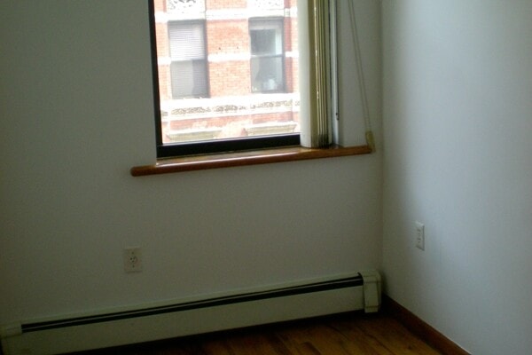
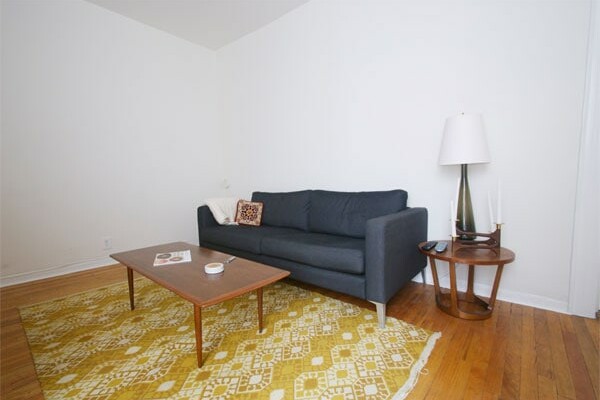
One of the more disturbing aspects (and unflattering angles) of my largely neglected living room is this wall:
![]()
Note the floors. Yes, they’re really that slanted. Vertigo victims should probably avoid my apartment.
Back to the wall. It is big and blank and ill-suited to any piece of furniture. Now, I’m not the sort of person who compulsively feels the need to fill every bit of empty space in my apartment with some type of furniture or display. Sometimes, vacant space in a room is just fine. But I can’t help feeling like this wall needs something, and I can’t help wishing that something was a colossal piece of artwork.
Unfortunately Franz Kline and Morris Louis aren’t taking my calls, so I think it’s time to get crafty.
To be clear: I’m not an artist. Yes, as a lonely 12-14 year old I dabbled in the under-appreciated fine art of scrap-booking and I can papier-maché the shit out of a balloon, but I wouldn’t flatter myself with a blank canvas and a fancy supply of painting paraphernalia. I’ll leave that sort of thing to people who think deep thoughts and possess such traits as talent and perspective.
But there’s hope. Possibly for big art, possibly for finally convincing some of you of my substandard taste, possibly for both. Because just a couple weeks ago, I picked up about 300 of these “Language Development” flashcards for only $10 in a junk store. Each one is a little over 6″ x 8″. Here’s a very small, pretty random sample:

The cards above were produced in 1980. But that’s not all! There are also illustrated cards from 1968:

The 60s cards are too kitschy for in here, but I’m pretty stupidly smitten with the 1980 set. They all spawn from the following exciting categories: Food, Colors & Shapes, Clothing, Household Items, Personal Items, Rooms, School Items, Tools & Hardware, Toys, Body Parts, Transportation, and Animals.
So not only can I brush up on my basic nouns, I think I can also create something colorful, fun, and huge once I decide on an engaging way to display them. To add an air of sophistication, I’m thinking of entitling my piece Postmodern Composition Number IV. Throw in a beret and a cigarette and I think we’ve really got something.


Totally love the 80s set too! I remember being quite taken with the way these paint chips were hung and badly want to do something similar myself to spruce up an otherwise blank wall: http://homedesign.marthastewart.com/2010/03/color-color-color.html (very similar to Chandler’s art project actually now I think of it!) Something about all those coloured squares makes me very happy.
(Long time reader, first time commenter – love your blog Daniel!)
I need to frame that stack of pancakes.
Oh you should mount a grid with a ton of them on a large thing of gatorboard or masonite or something something smooth, and build a little simple inset square of 1×2’s on the back and have it float off the wall. You know what I mean? They are so cool. I love the 80’s ones.
Yeah!
http://www.massmoca.org/lewitt/walldrawing.php?id=414
DAMN. That idea is better (and probably cheaper, actually) than my idea… I might have to do it. Thanks Morgan!
the sixties would be adorable in the kitchen, no? Especially since a lot of them picture food. But you probably don’t have a large wall screaming for something in your kitchen.
I could see something interactive, like multiple rolodex-style rotators so you can make a pictorial sentence. A magnet board (like a giant fridge) may be too kitschy, but integrating the interactivity into the art could create something only possible with these cards.
Can’t wait to see how you display those cards. I have a vintage set of alphabet flash cards that I have been wanting to put together but can’t quite figure out how. Waiting for your display to inspire me. Love this blog!!
But the jello mold would be so cute in the kitchen! I think your idea for the living will turn out fantastic. I think you should display them on clip boards. Then keep the extras nearby. So you can swap some out if if you feel like it, or encourage guests to create Postmodern Composition Number VIII. Document how this little $10 artwork evolves.
Love the set from the 80s – the color scheme is perfect! And LOVE that you’re back :)
Those cards are great! I second the masonite suggest. You could also mount them individually on the masonite and attach to the wall with velcro…(you can staple the velcro to the wall instead of sticking it so you don’t damage the wall) then you can change them around if you wish. The velcro also hangs the pieces flush to the wall with no movement. We have also used cheap Ikea plain frames (the ones they sell in 3 pks) painted them and velcroed those to the wall.
i, too, love the eighties cards. i think you are really on to something fabulous.
i would add rainbows to the sixties ones. but i’m sure that’s just me.
can’t wait to see how you do things! and yes, i love this blog
Name 3-5 activities you want to happen in your livingroom on a regular basis.
I approve of this idea and look forward to the results.
I’m in agreement on the 60s ones. Those would look SO cute in a kitchen.
Can’t wait to see what you do with the wall! :)
I agree that the ’60’s are a little kitchy for the living room. Maybe another room? I am loving the ’80’s ones though. The colors seem perfectly strong and muted at the same time—which works with the fairly neutral palette you’ve got going on in there.
You could use Fotoclips to clip them all together (http://photojojo.com/store/awesomeness/fotoclips/) Or even just T-pins (google it, the link was horrifically long)… but, then you would have to put a hole through each card and you may not want that. Hmmm… Can’t wait to see what solution you come up with!
The 80’s cards would be really cool in the living room, so unexpected, and the pops of color would work well with what you have going on already. Can’t wait to see what you decide.
I think Morgan is right on with her suggestion to float them on panels away from the walls. That’ll help them to look more substantial and united.
Or, you know, just buy that Sol Lewitt installation instead.
Why does your apartment look SO DIFFERENT in photos? Not better or worse, just like a totally different place.
(BTW, if you decide you don’t want that rug, I’ll buy it off of you and put it in the white room upstairs at the house. I really need a rug in there, because we’re turning it into a music studio for Evan.)
And if you change your mind about wanting to buy that rug, I’ll be standing in line right behind you! I think it’s so cute!
I don’t know! I swear I’m not a good enough photographer (or photoshopper) to be doing anything tricky here. I think cameras do weird things to small spaces or something.
Cool loot! How about something like this to display them:
http://photojojo.com/store/awesomeness/magnetic-photo-rope/
They are a little expensive, but probably something you could DIY for much less.
Can’t wait to see what you dooooo!
Question? Is the ceiling parallel to the sloping floor or square? You may want to “compensate” for the slope with the art somehow…or the slope might look even worse.
Nothing says you have to leave the cards rectangular. You could use some colored paper or painted wood for the background (maybe the color of the rug) and cut the cards into funky shapes or just triangles off the corners so you have diamond shapes of the background color.
Or you could break them up occasionally with a small shelf and place a “modern” item on the shelf near the card. i.e. digital clock near the analog, etc. Funky, yet a little functional as well. LOL!
Looking forward to seeing your end result!
Neither the ceiling nor the floor are level, but the floor slopes much more than the ceiling does. I’m not really sure how I’d go about compensating other than to hang the art level and just hope that it distracts from the structural lines of the room. It’s nothing I can really fix, so the best approach might just be ignoring it…
I have the same issue with the big empty wall AND the uneven as hell floors.
There has been nothing behind my couch since the day we moved in and I can’t afford anything that I like.
As for the uneven floors, I just spent 3 hours last night putting together one of those space saver cabinets that you stand behind your toilet, only to discover that it would take an INCH of folded up cardboard on the left side just to make it even.
Can we say TACKY!
So I have to disassemble the jackwad and take it back to the store! UGH!
Congratulations Daniel, on your special new mention in Shelterpop! Such a nice mention. http://www.shelterpop.com/2011/03/11/best-design-blogs/?v_t=comsearch50
Also, the world will wake up and keep noticing you–opening up tons of possibilities for you and what you want to do with your life. Just stay true to the inner you. Love you and those hot dance moves!
I hope you realize how nice your mom is :)
I do! She’s my biggest fan and I’m pretty sure I’m hers too. Total mama’s boy, and proud of it.
Hi – You could “pin” each card to the wall, uniformly (very little space between cards), to end up making a very long rectangle shape (like 4 cards up and 15 across – guessing). Or, just one very long horizontal line of cards. What about painting the wall a color? Also, one wallpapered wall is so good – some fantastic wallpapers to be had. I am still partial to Cole & Sons “forest” paper in white/charcoal.
I’m sure whatever you do will be a blast! Can’t wait to see the final result. Love your style.
This picture of your LR really hihghlights the space issue. The pics on your previous post didn’t quite capture it for me.
I saw an art display in the March 28th edition of Woman’s World and thought of you. Very easy peasy, looks great in the picture on p. 37 of the magazine, and it’s inexpensive to boot.
Here it is: Mount the cards on colorful pieces of posterboard. Tack to the wall with Scotch wall-mounting tabs or Command poster strips. Won’t have any holes to fill or repainting to do when it’s time to move. And, you could tie in the posterboard colors with the other rug you are planning to use.
Love your blog! Love your Mom!
I agree, 80’s cards is where it’s at. That’s going to look cool.
Troy’s interactivity idea is good! I say laundry lines (is that what you call them? In the UK they’re washing lines but I’m trying to translate for you…) and small pegs to hold the cards on – so people can change the order. But the lines/wires need to be really tight so they’re straight. Lots of lines to make a big grid when the cards are pegged on.
i would like to see that big wall painted in a matte black colour…
I say go with the cards from the 80’s and cover a large portion of the wall—I think that would look fantastic paired with some of the mid century teak furniture you have going on in the living room. I would also have to agree that the cards from the 60’s look more suitable for a kitchen wall…..but I wouldn’t exhaust the idea by doing both…..use this for the living room!
Pug kisses from Mamma B.
;-)
What an amazing idea. Can’t wait to see that one completed.
Brilliant, i like them ll next to each other but wihout ending in a squared off edge. and make them level, always level regardless of the floor of ceiling
What about a grid of cheap IKEA frames? use duct tape on back to put them all together….you may have to scroll down in this link to get to the picture I am talking about, but like this:
http://www.newyorksocialdiary.com/node/32280
or report covers, these were in blueprint magazine like a 100 yrs ago, but like this:
http://www.marthastewart.com/photogallery/home-tour-manhattan-loft#slide_10
or paint the whole wall with magnetic paint and move around at will.
I love how your place is developing and always look forward to stopping by your virtual home…especially since I lived up by you for many years…..miss those little UES thrift stores….have you been to the one on 84th btwn 2nd and 3rd? Always used to find gems there…have a knock off tulip chair that I got for there for $15!
I think I know what you need! PAINT! Possibly a dark color like this? http://abchao.com/blog/2009/9/10/our-bedroom-before-and-after.html
and then some cool art, of course.